It’s reporting Friday on the calendar, so settle in and check the results of our work!
Hello everyone, let’s start!
I VFX
We’ve already told pretty much about mechanics of obelisks.
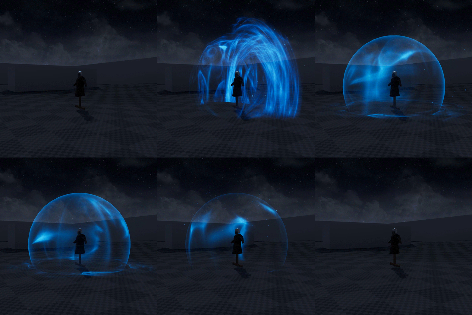
That’s how the magic tower shield will look like. We will tell you about differences between usual and tower shield in more detail in the video-review of combat system 2.0.
That’s how the most basic magic wall will look like. This wall will be possible to cover the whole group. Also there will be a wall with a pronounced stone outline. Spell will cost more mana, cast will be longer, but the wall will be stronger.
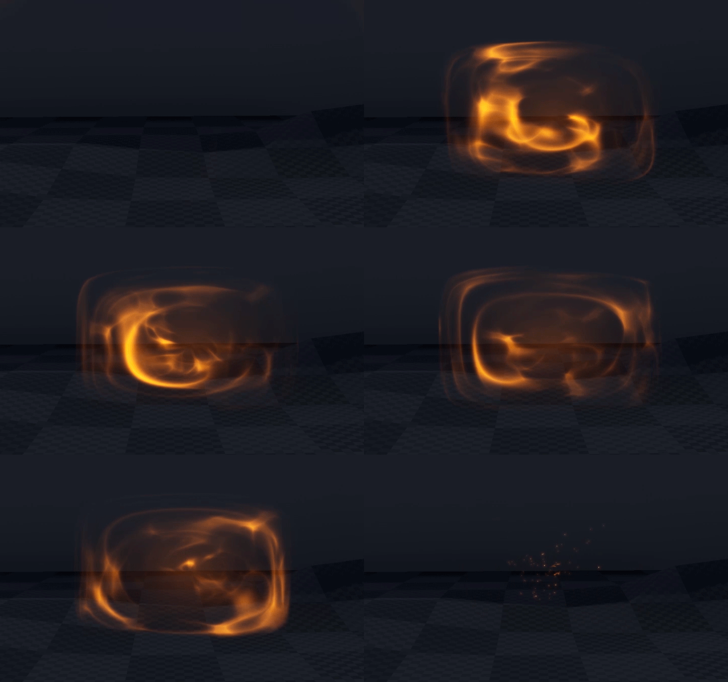
This is an egg that can cover a character on all sides and save him from an enemies’ attack. And a “stowaway” who will be lucky to drop in it.
II Animations
We also prepared animations with the mantra book. But it makes a page with GIFs heavier, so we decided to show the whole dwarf animation and leave the book for the next time.
Dwarf is a complicated person. On the one hand, he has unattractive appearance but on the other hand the animations are different - some of them are serious and some of them are funny.
Let’s start with serious one.
That’s how a dward runs into battle. He is not a yellow-bellied and never runs away - only fight!
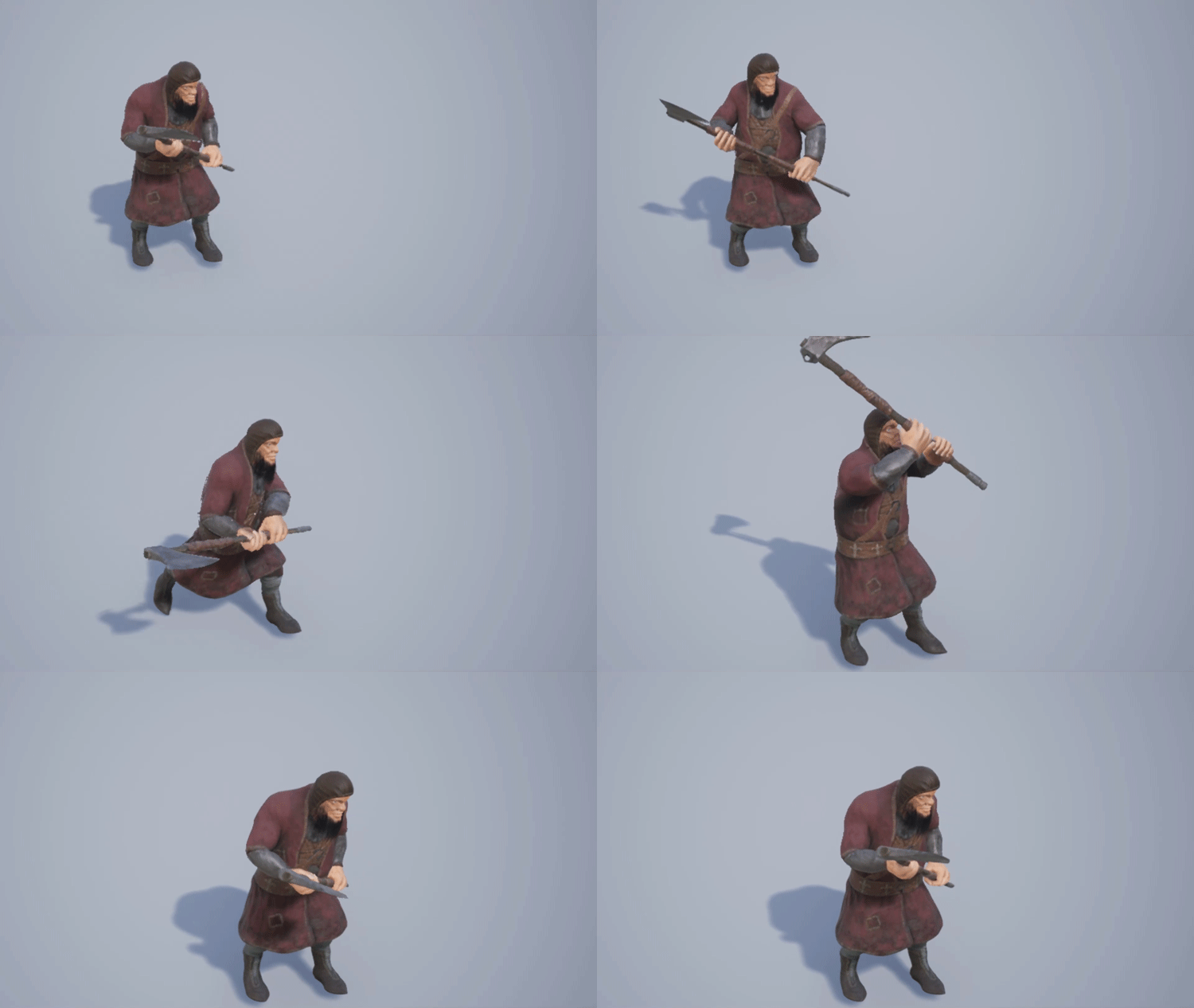
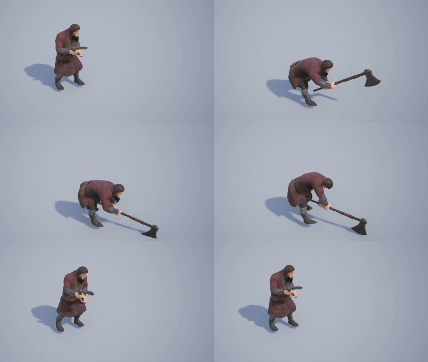
That’s how his fast attack looks like. Even better: “fast”.
Here’s the thing. The fast animations actually look pretty bad. We added nasty dispels and debuffs to his attacks.
That’s how his heavy attack looks like. Almost every hit will put the nastiest debuff.
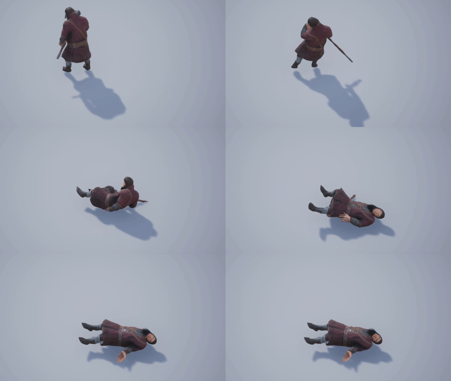
That’s how the tragic death of a dwarf looks like:
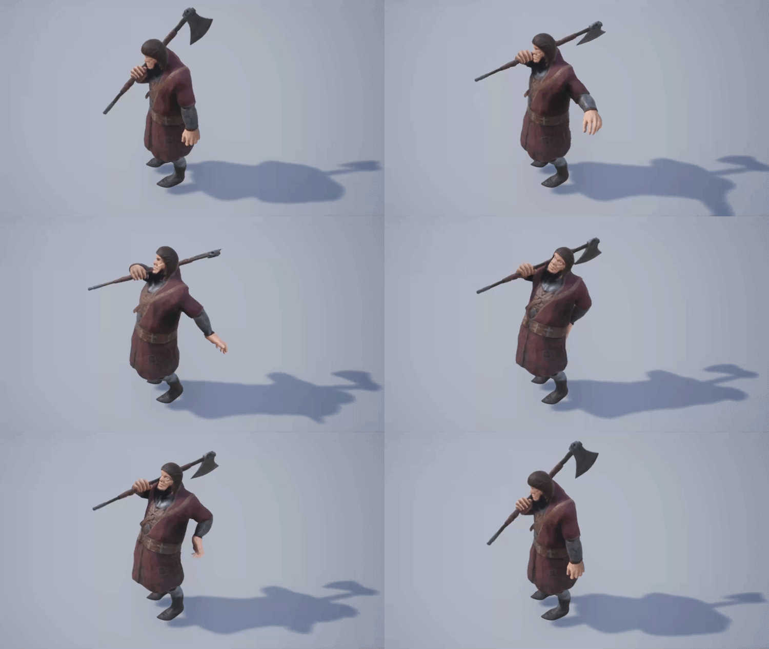
Here’s a dwarf passing the time and he doesn’t care if someone is watching him:
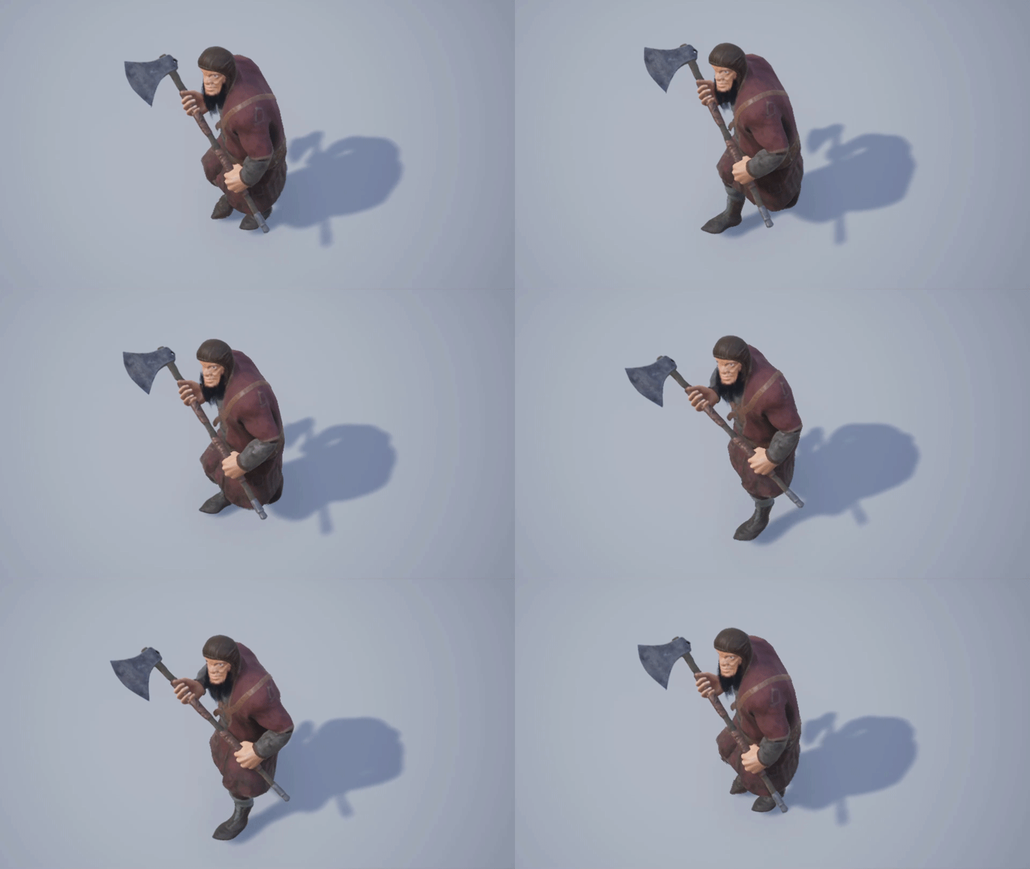
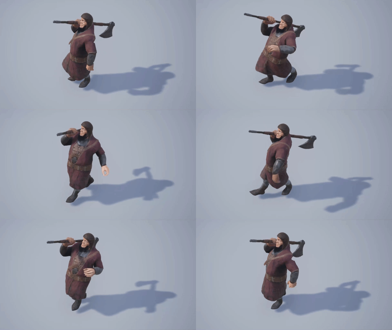
Now, pay close attention, that’s a dwarf’s gait:
Recognize?
Well, a dwarf is one of the most outrageous mobs in the game. And he can afford it, for God’s sake! Drawing this animation, it was hard to adapt it to the height and an axe in hand.
It’s difficult to determine who suggested this idea, but let’s get one thing straight - it’s “in step with the times”.
III 3D models
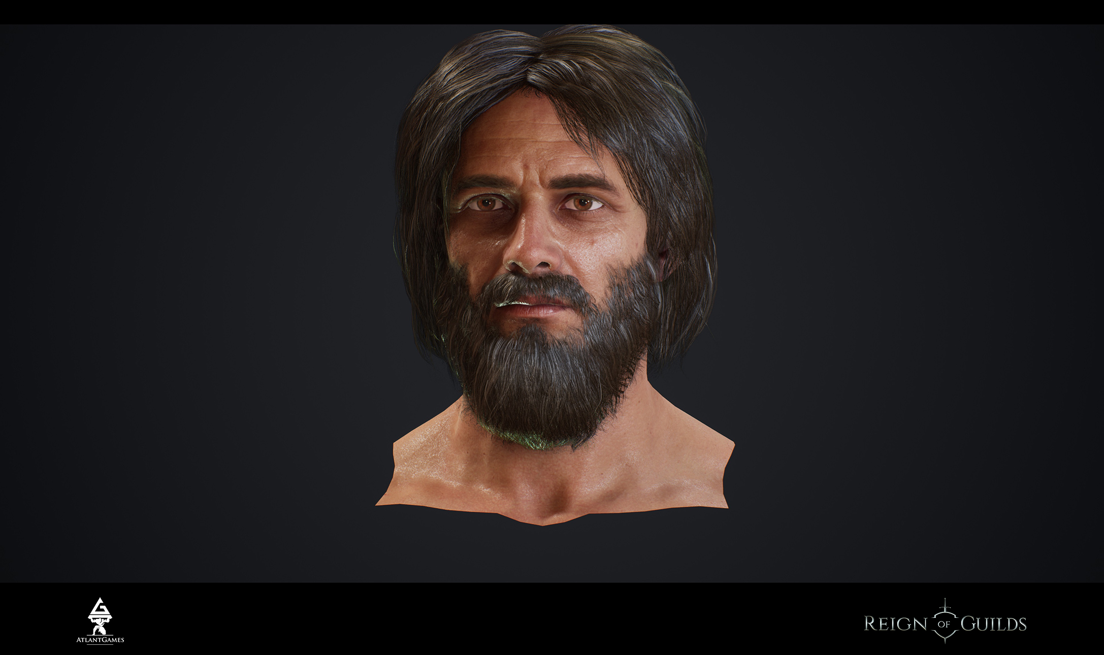
Head
Someone asked us on the forum - if we had any inappropriate or outdated content.
We will certainly devote our report to it because we have a lot of such content, especially test tasks (they are paid so we can’t publish it).
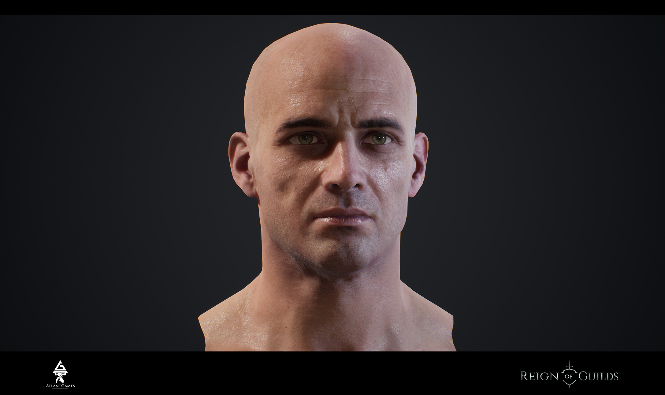
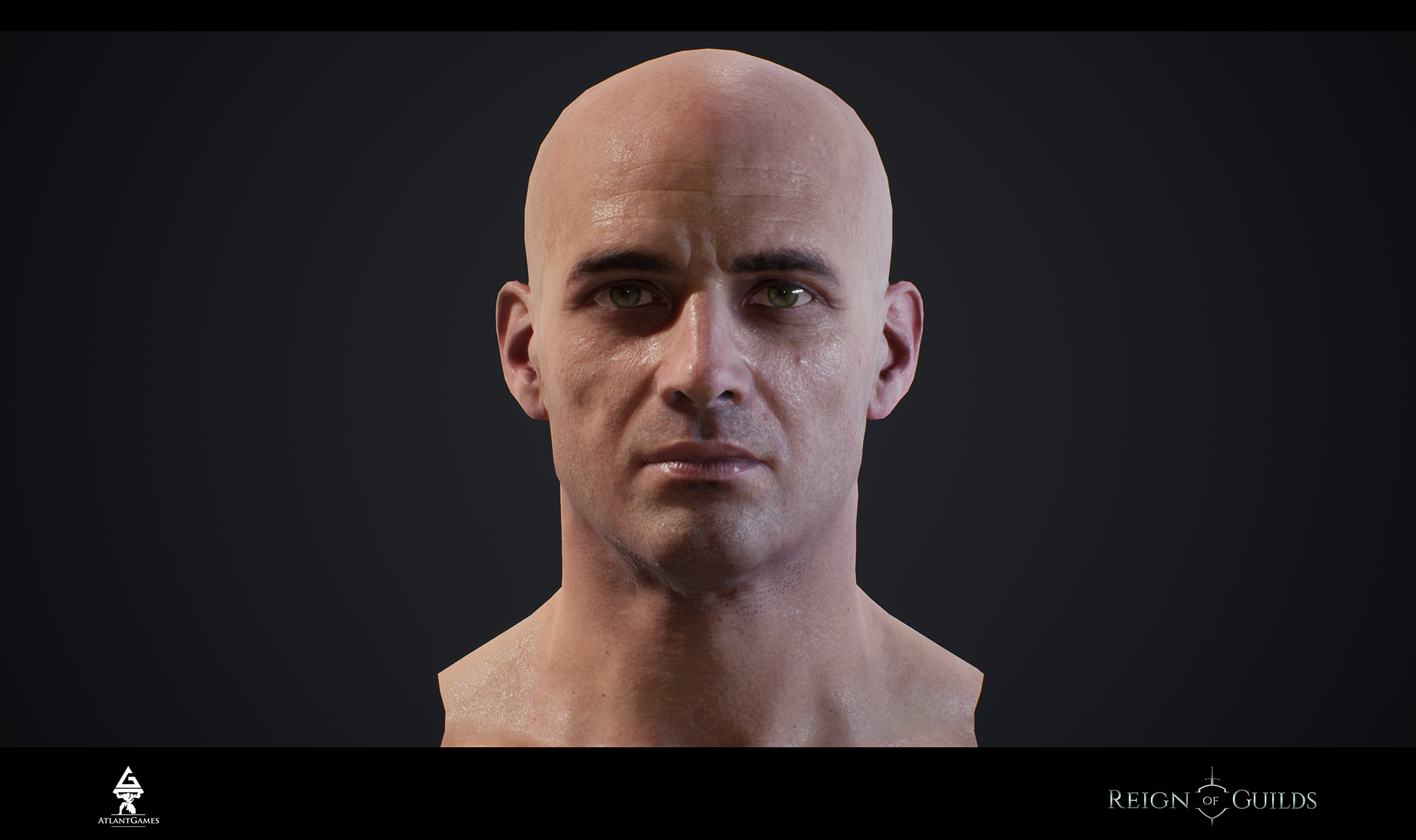
And now it’s time to introduce a new head.
Last head had bad face morphs. On the stage of coding it was impossible to use it.
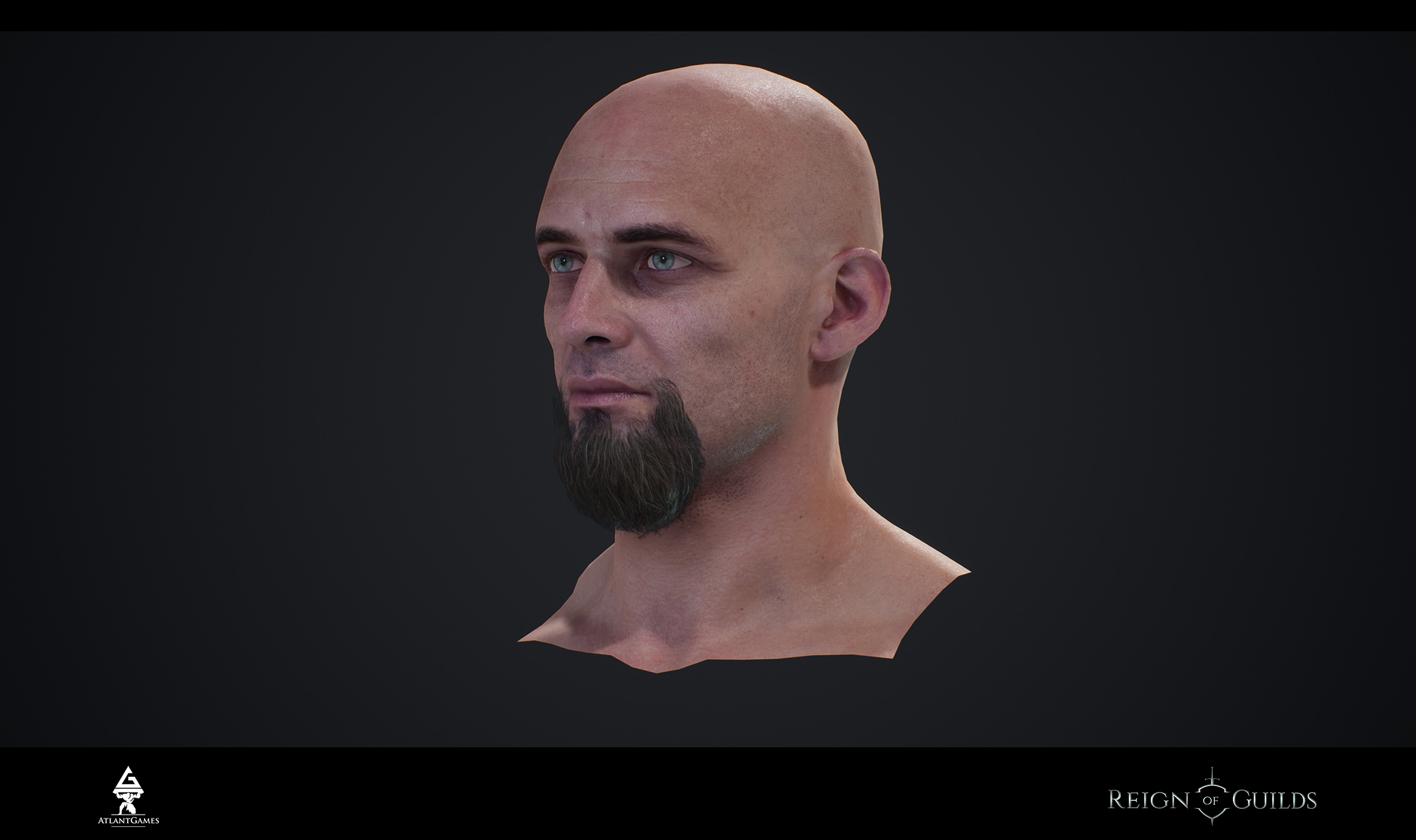
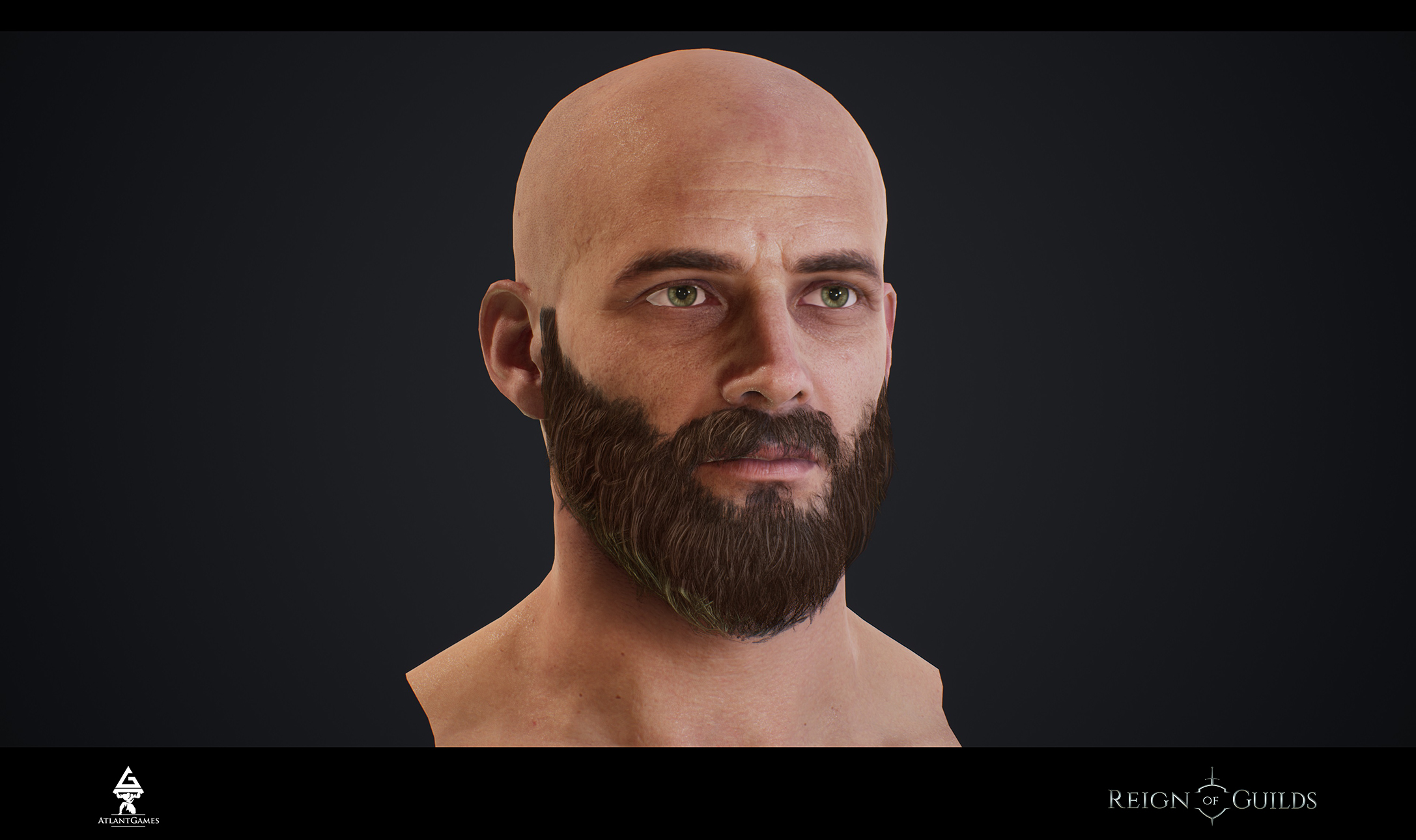
Here’s new head and its variants with the little edits in proportions of face and hairs.
That’s our first draft on the left. “Can we make NPC of the handsome head?”
In our opinion it turned out quite funny.
How do you think, how can we use left head? What character? In contrast, right head is lean variant of a character’s face.
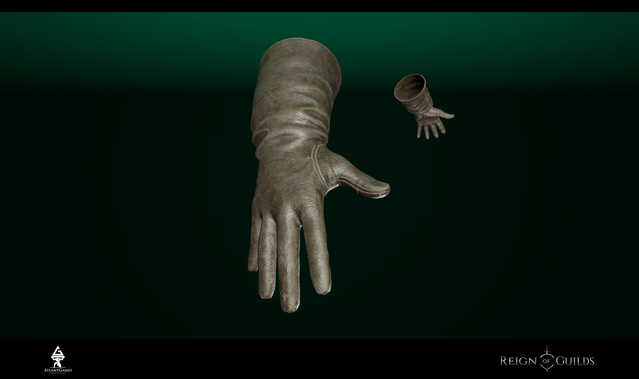
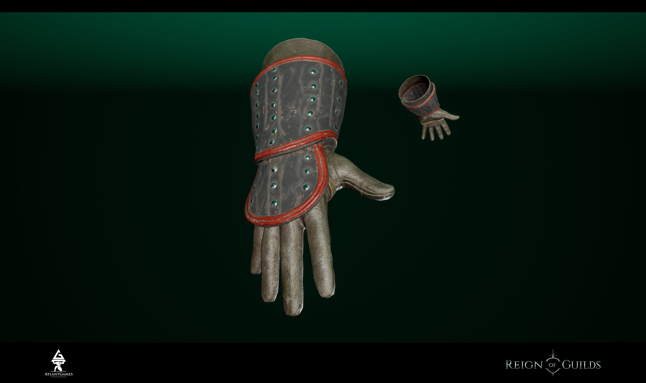
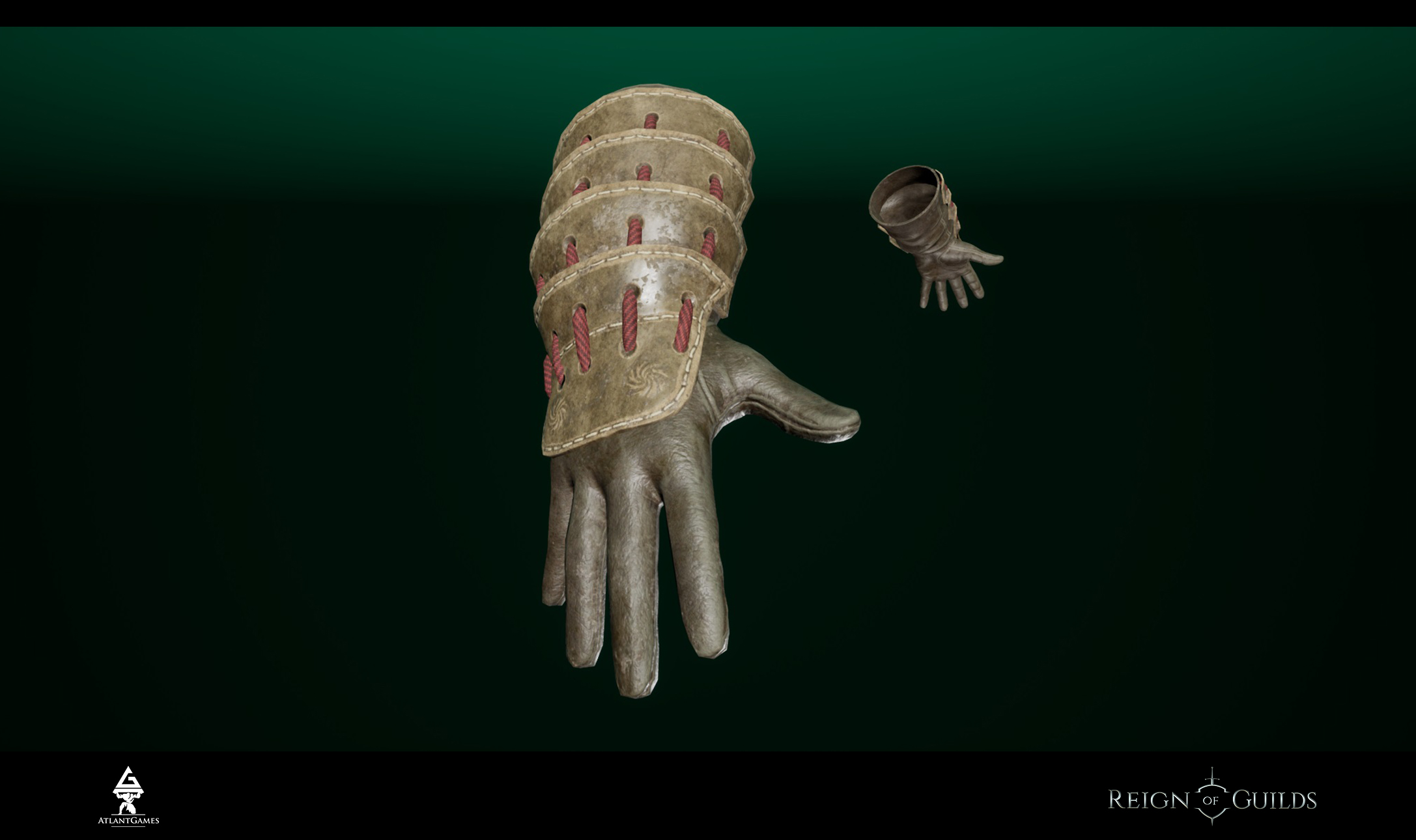
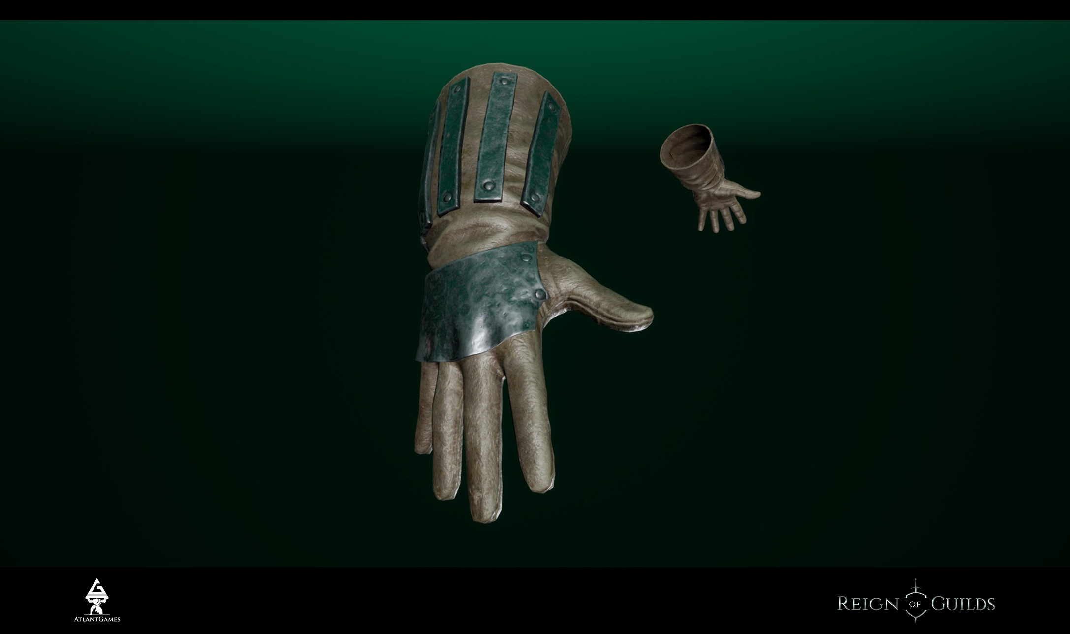
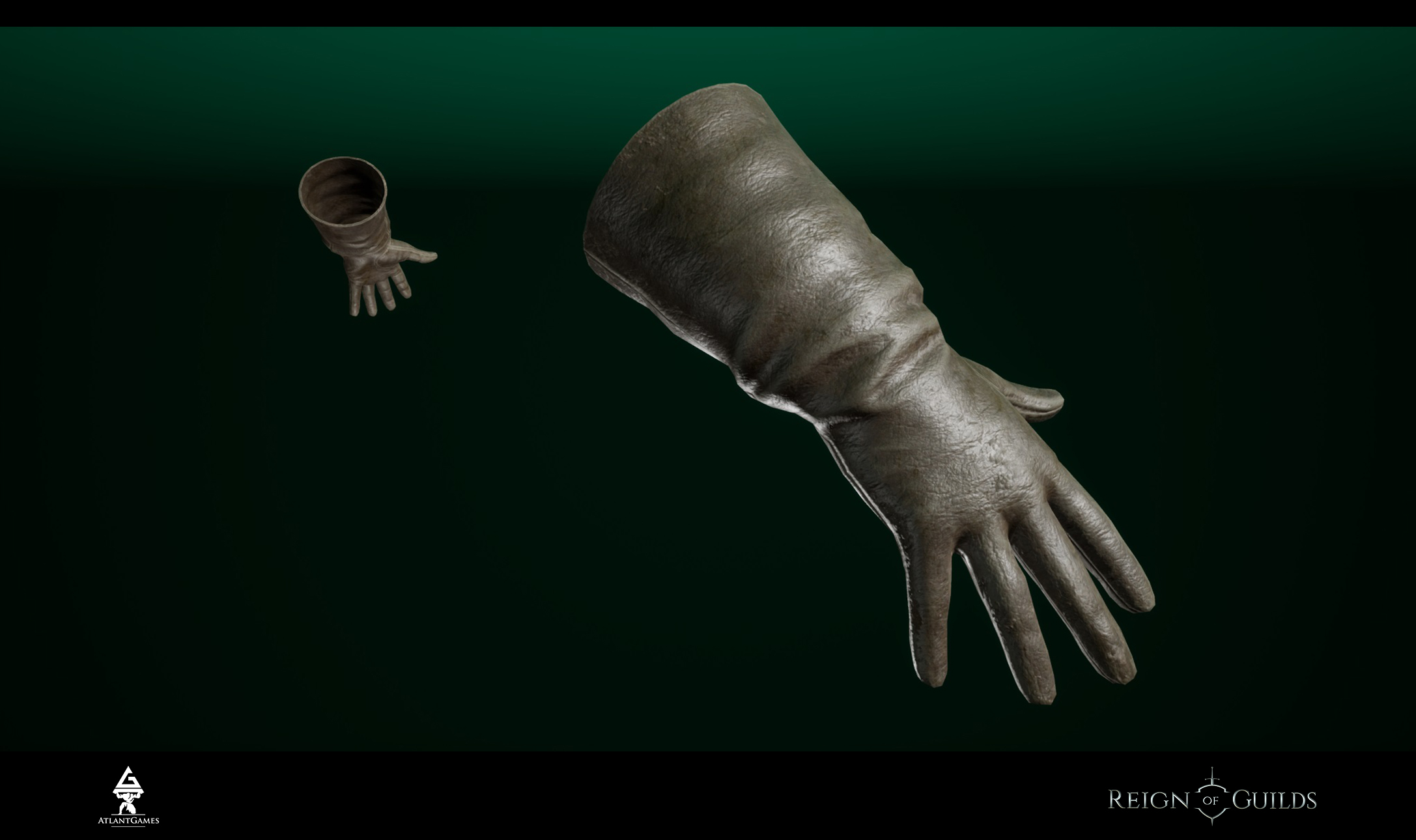
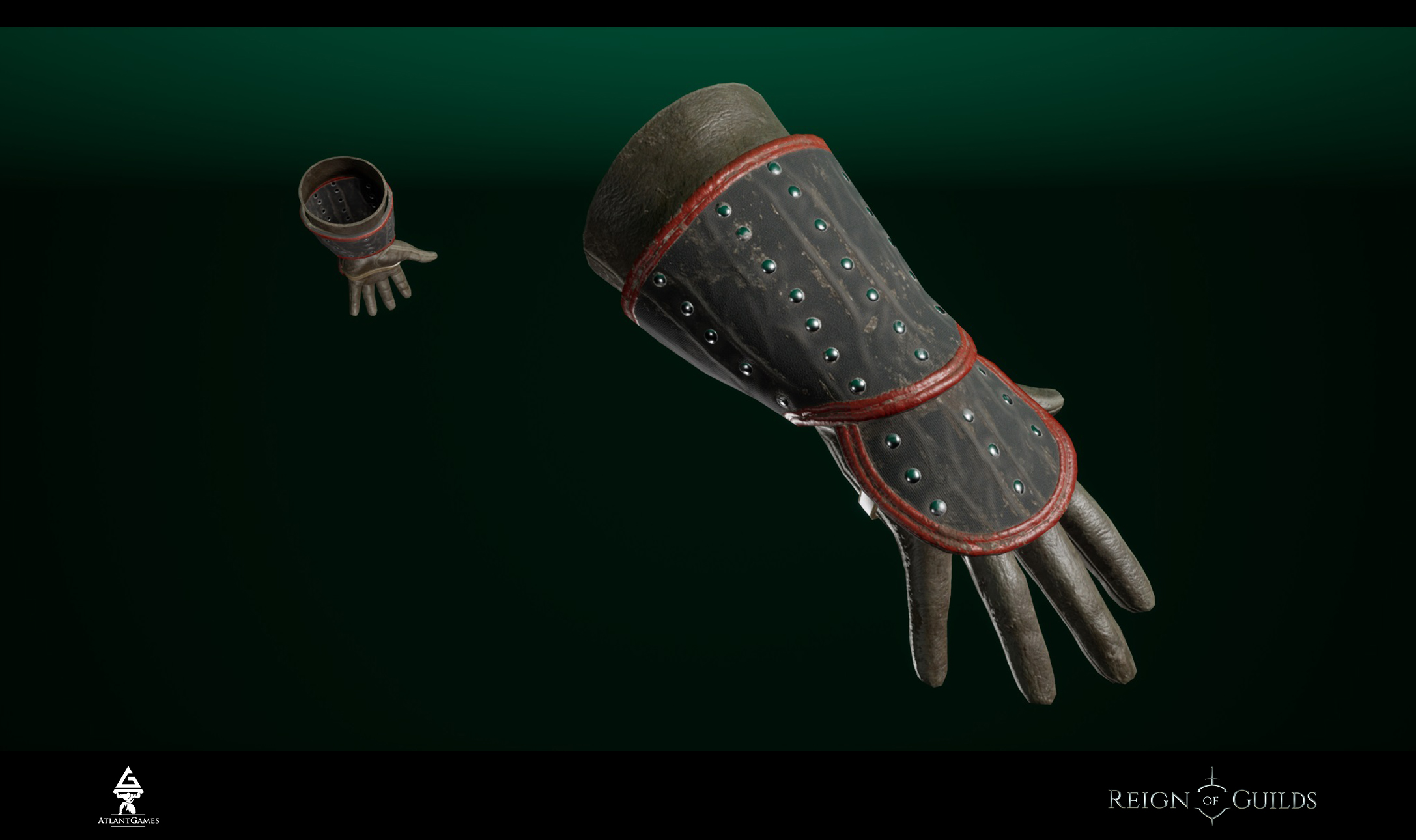
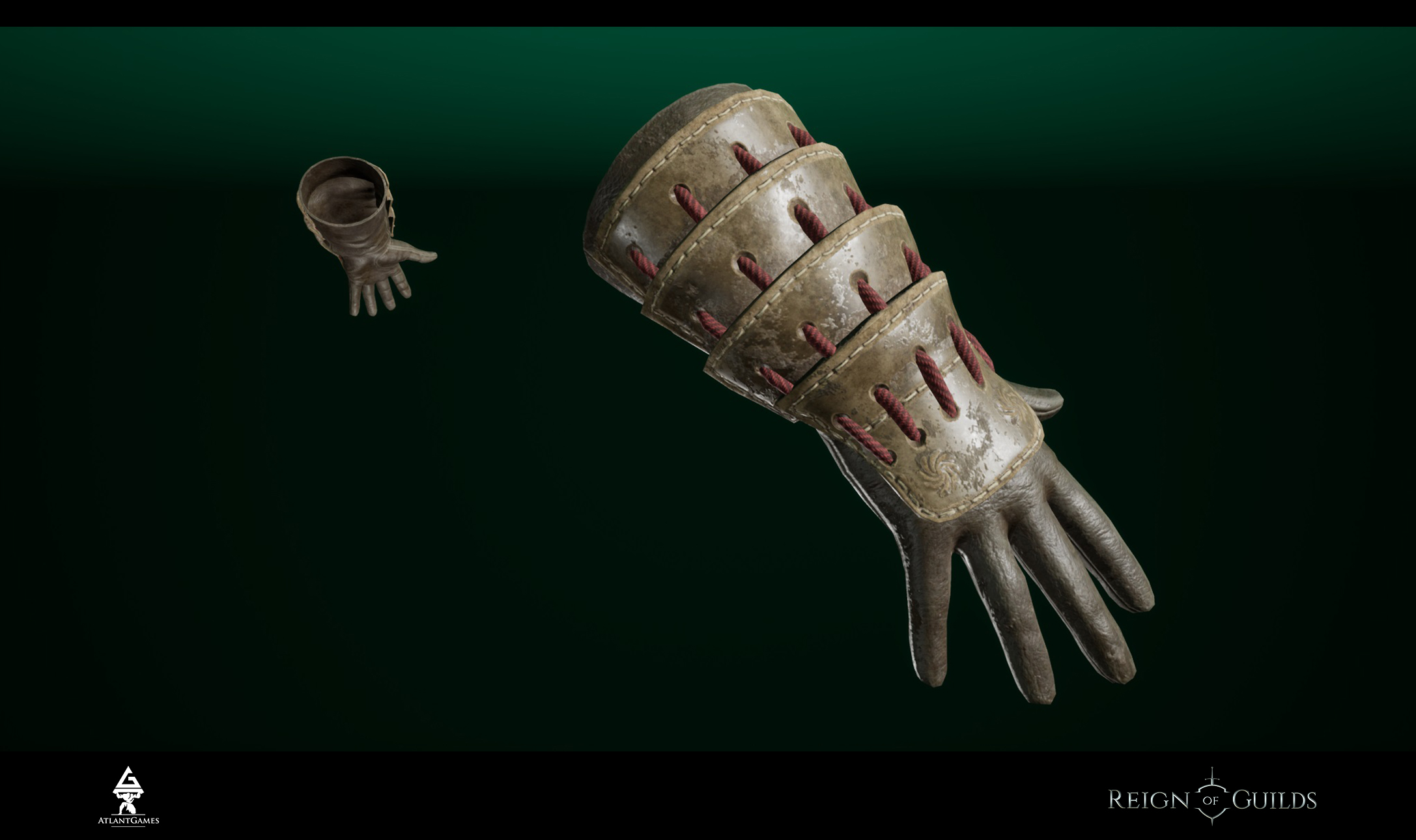
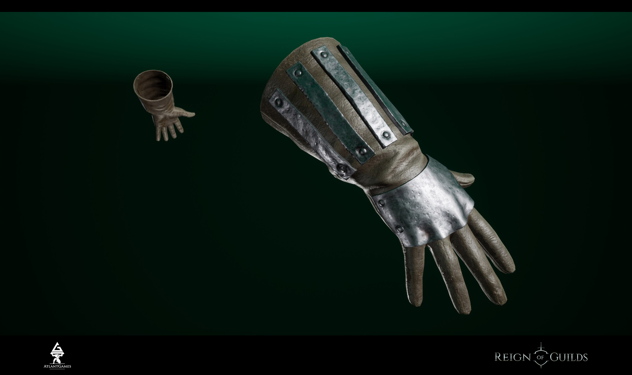
Gloves
It requires no comments. They have different heaviness.
IV Conclusion
We would also like to say - today our new programmer Pavel have moved to Saint Petersburg. He is going to start the work on the project this weekend.
We will tell you about the development, our ideas and worries soon, but it’s not as interesting and funny as game content)
Thank you for reading us!
Yours sincerely,
Reign of Guilds Team
