Friends!
Today is Friday, and 2-nd weekly report is on the air. Here you will find the work on the level design, 3D models, VFX, animations and UI.
I Level design
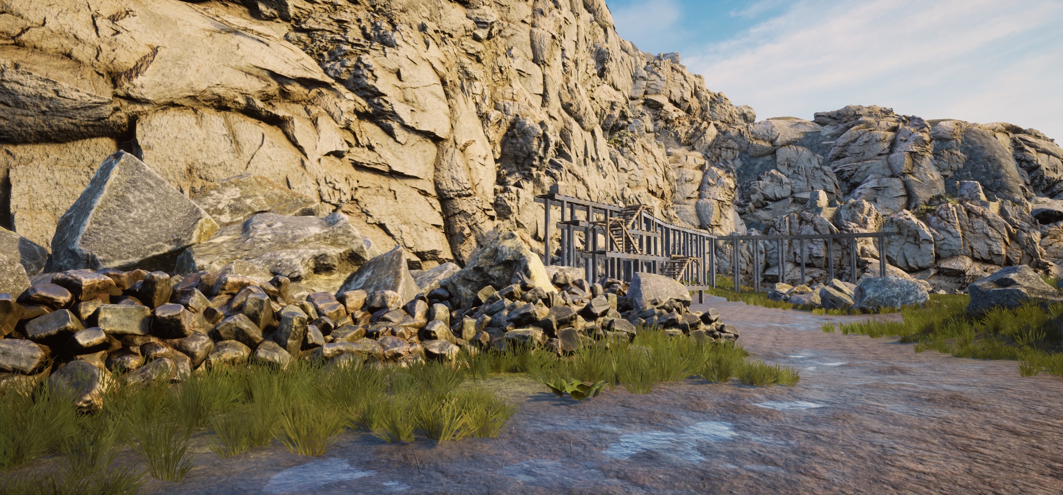
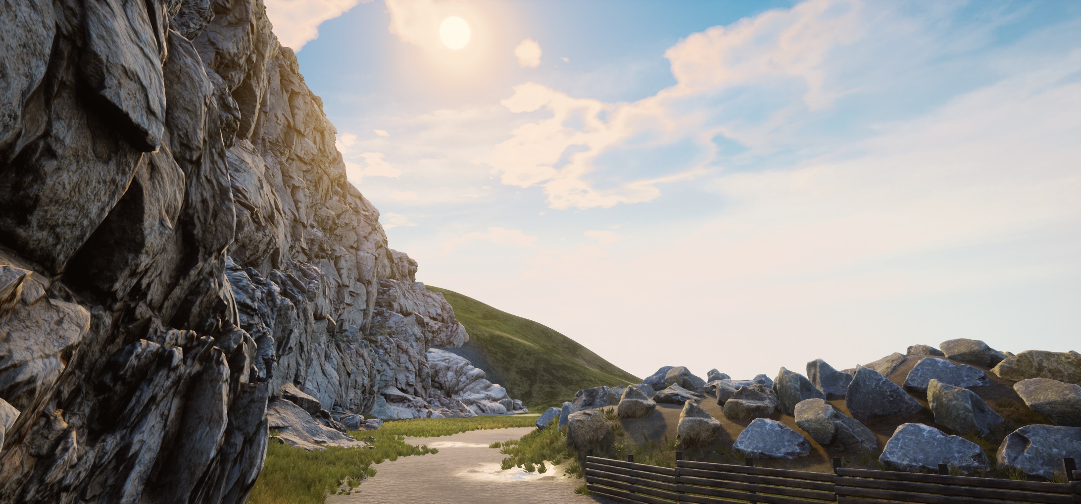
Mining and processing of resources
We obviate the need to spend thousands of hours clicking LMB next to the rock and watching the character fill his supplies with sparks flying from the pick.
However, you still should spend much time in mining locations.
A list of types of locations and resources has already been approved, but recently we made two important decisions:
- We rewarded the counties with some resources in varying degrees with an obvious surplus and deficit to stimulate the trade and movement of resources between the counties;
- We increased the number of locations with resources in 4 times (now the number will be about 16) to minimize the risk of holding of all respawns by one zerg.
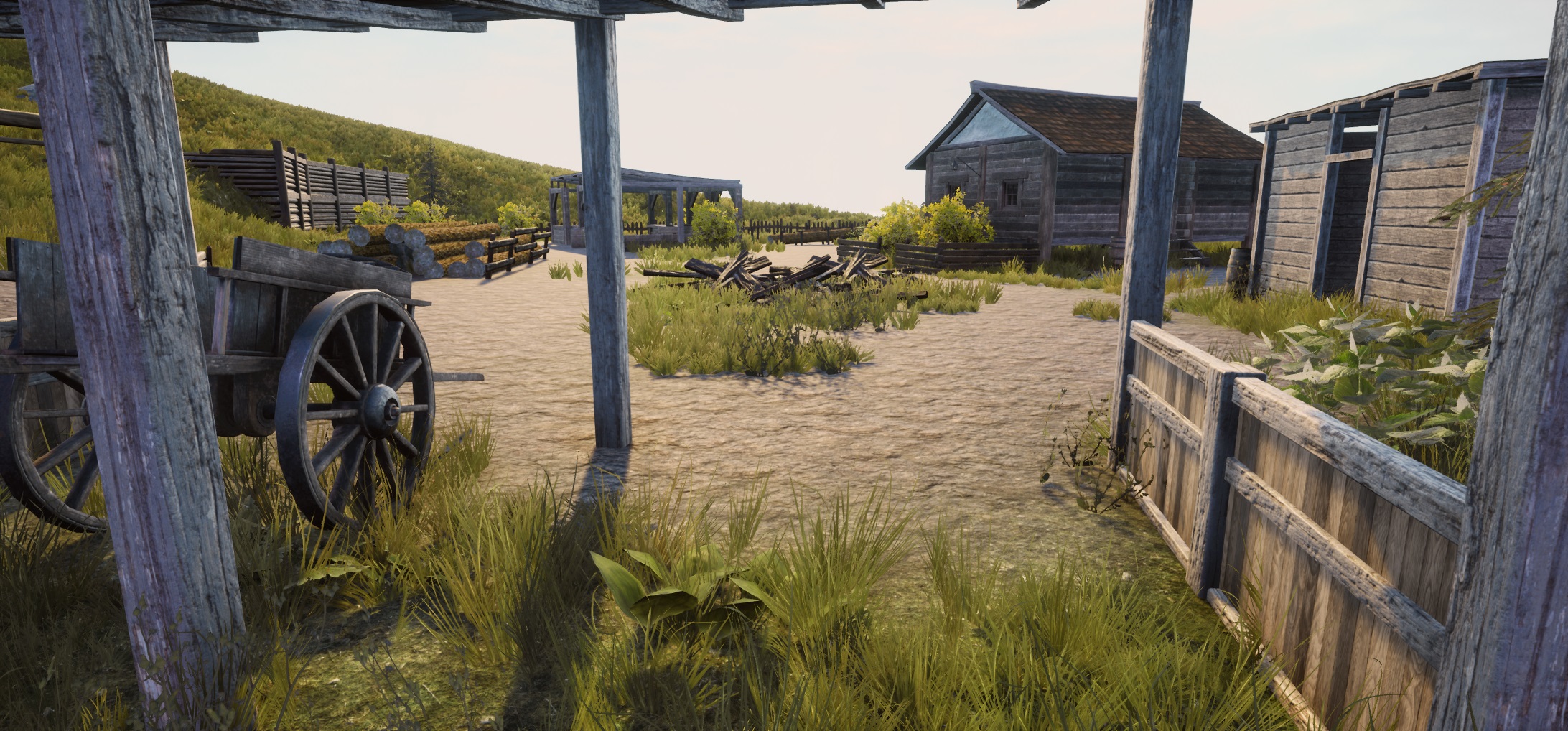
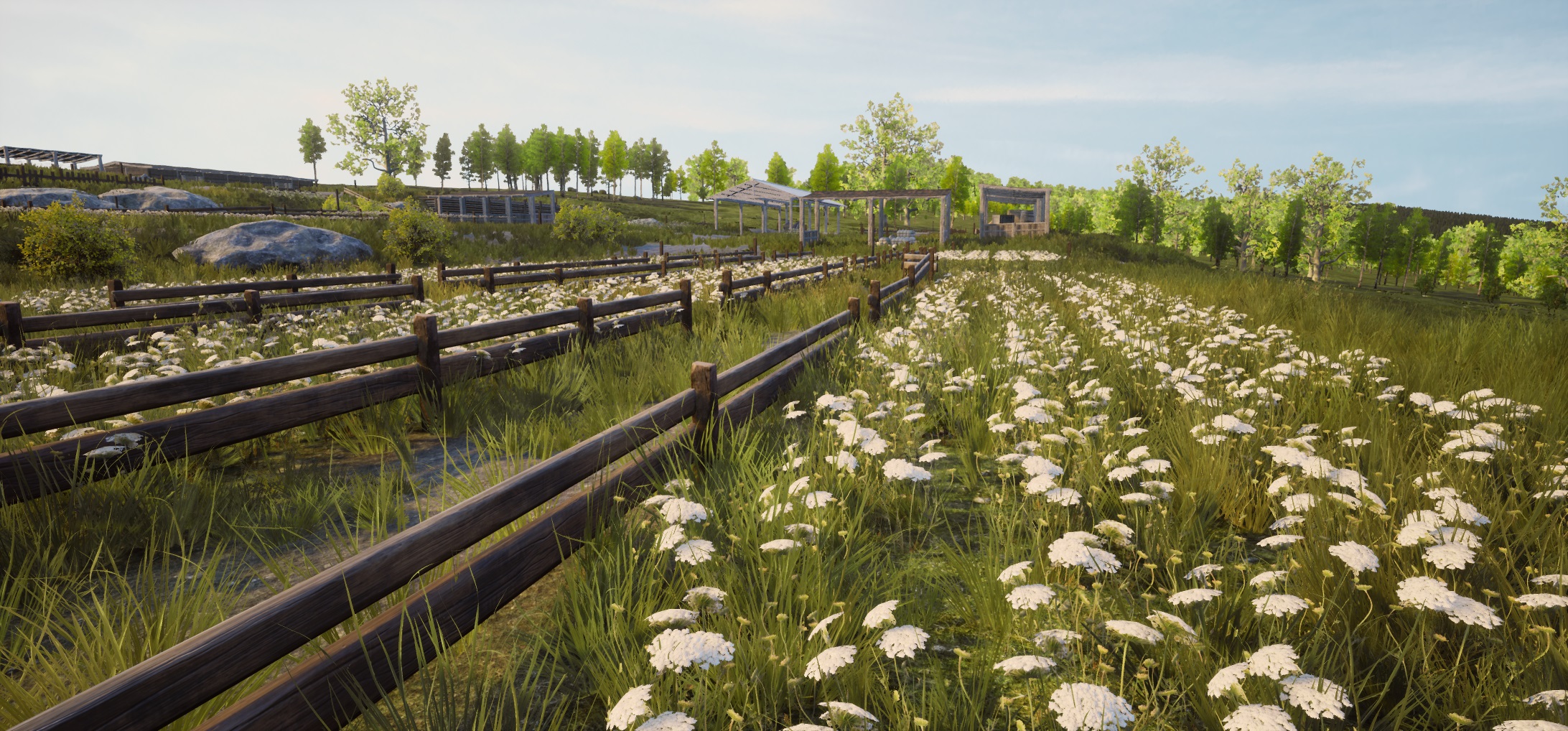
Locations look like this:
This farmer was clearly a lieutenant in the closest military unit. Training dummies discarded by himself keep hated birds away from his favourite vegetable patches.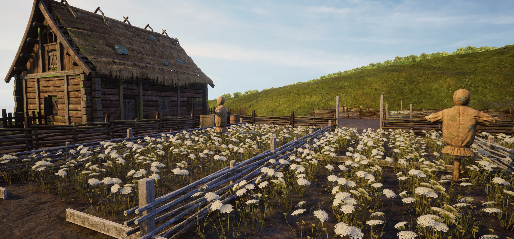
II 3D models
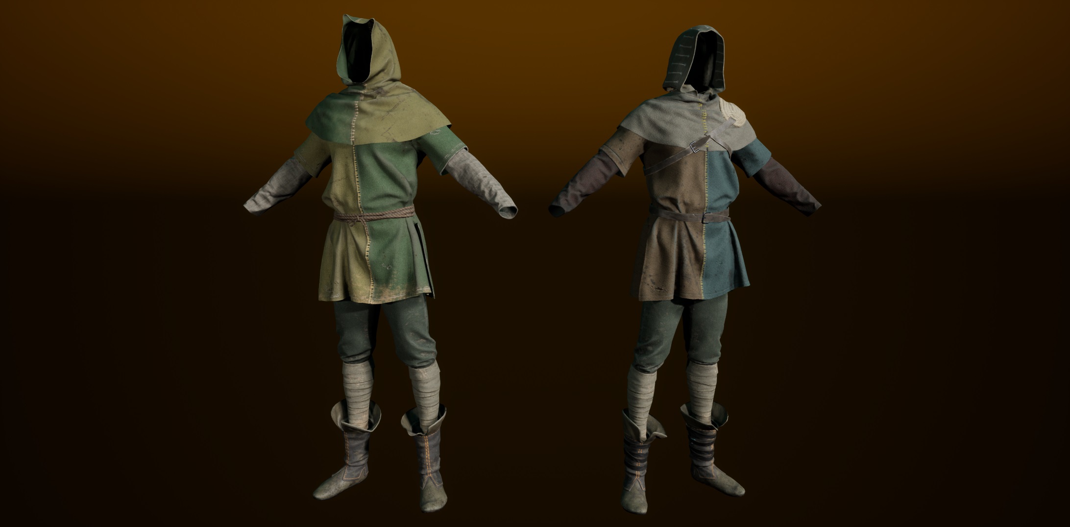
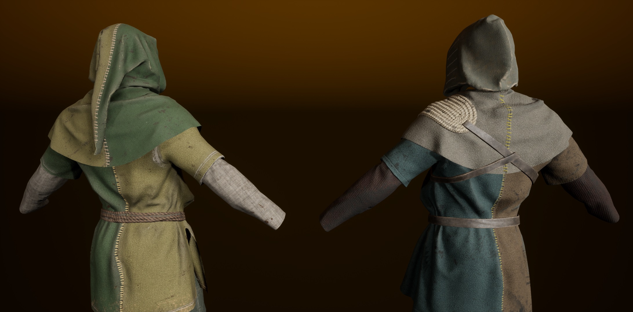
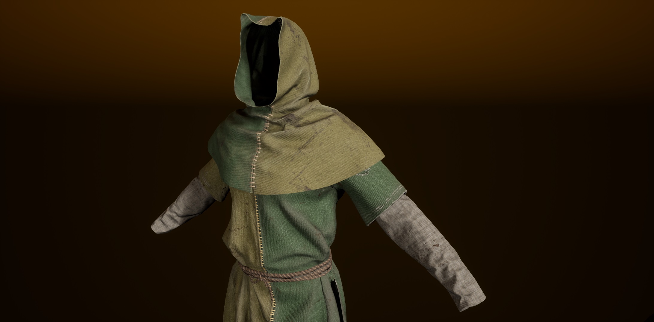
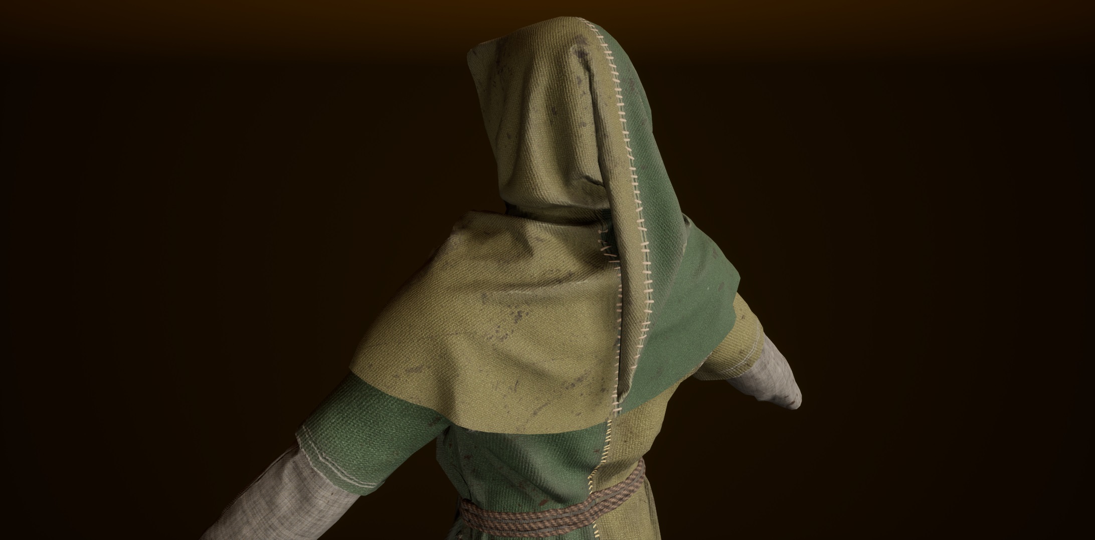
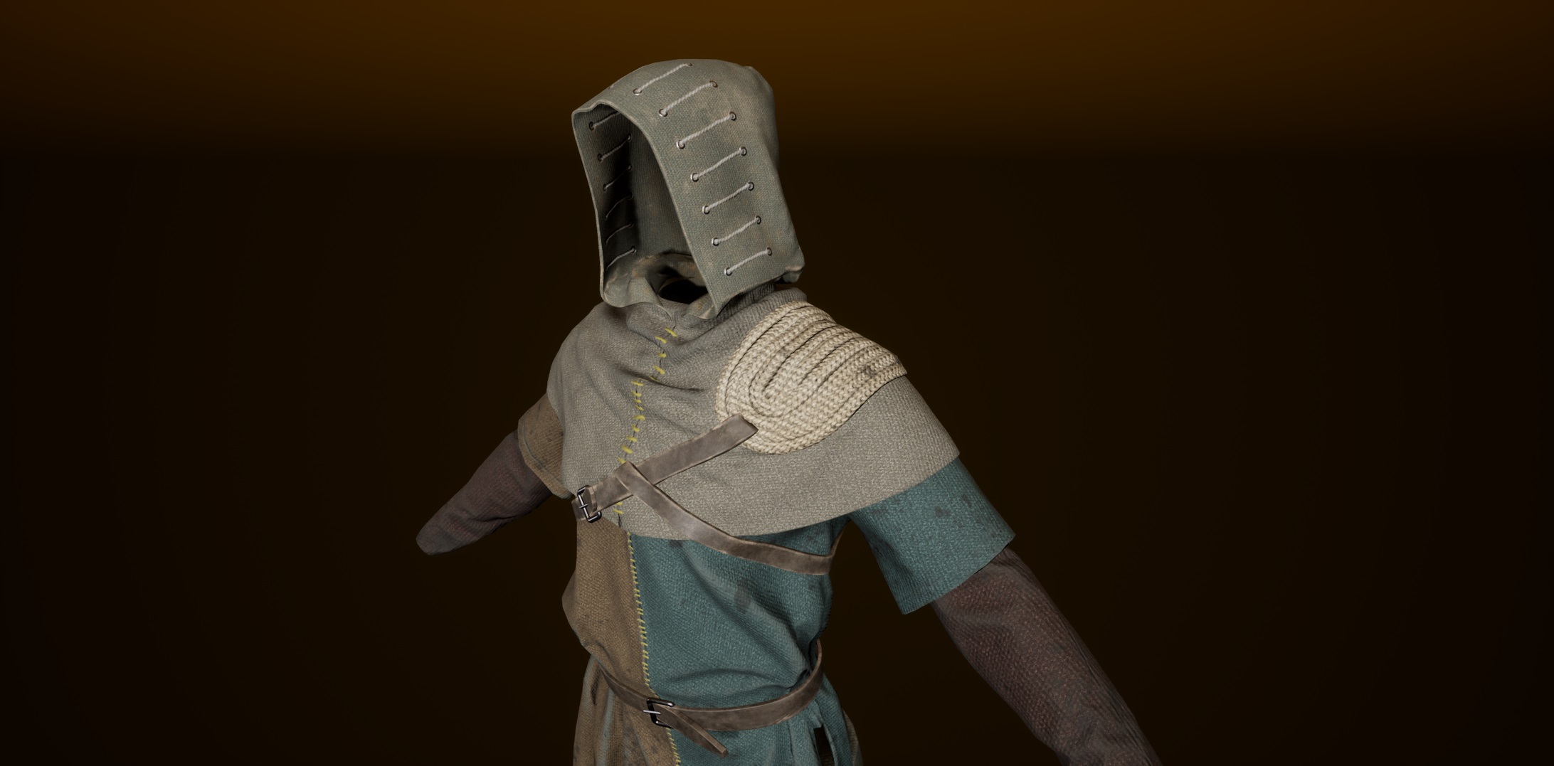
Hunter
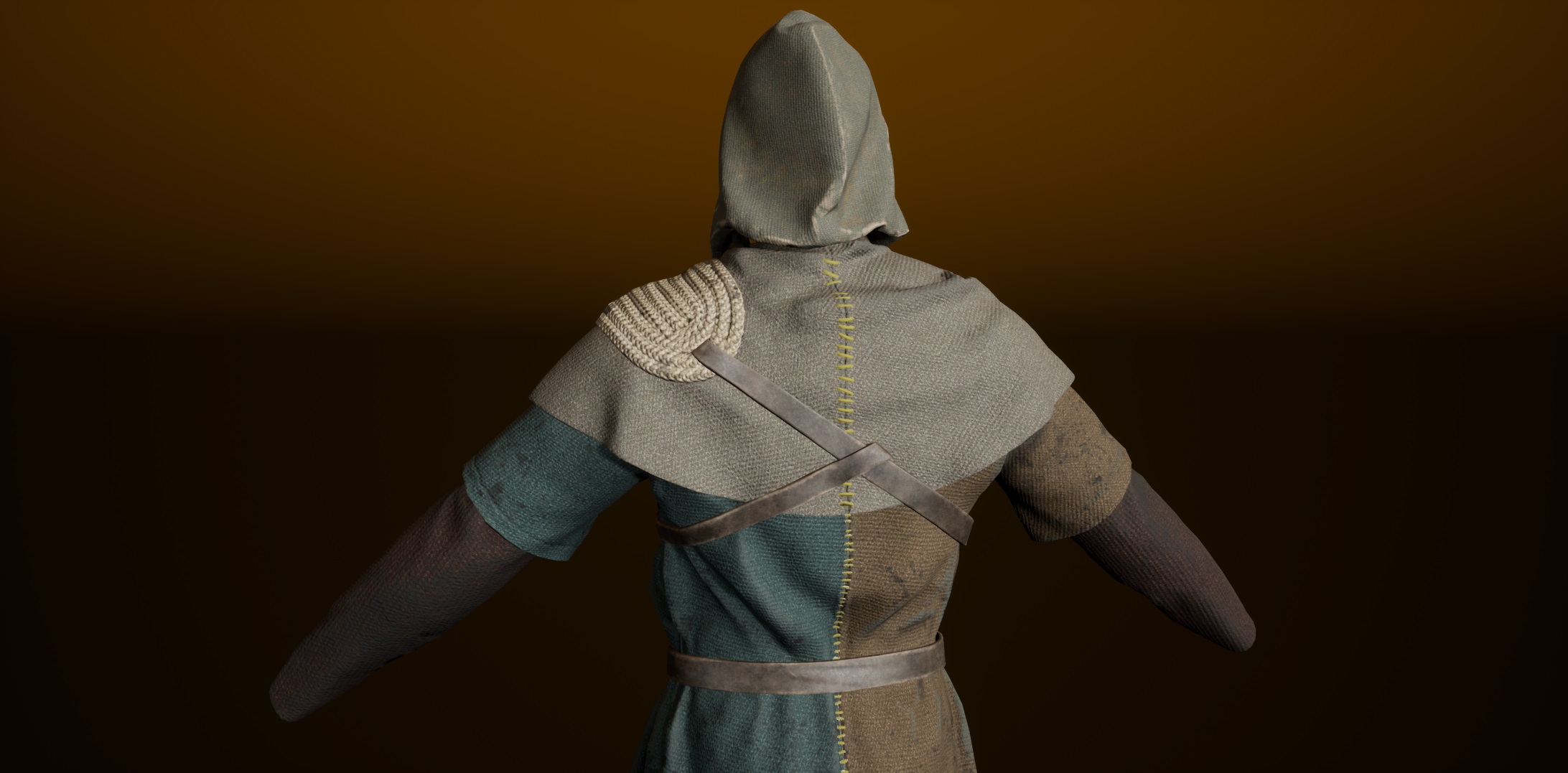
Hunter will have 2 ways of development: light armour and bow, and medium armour with crossbow. A suitable variant can be to use high tiers of light armour with low tiers of medium armour and vice versa.
Today we will show first two tiers of light armour for hunter. As always a part of items - his “prof. items”, and the other part has no professional requirements.
III VFX portals
The teleport system is significant factor in development of the scale and structure of the realm. Players need the teleport tokens to use the portals. Some of them will be available, but some of them will be very hard to get. We already told about teleport system in our previous article.
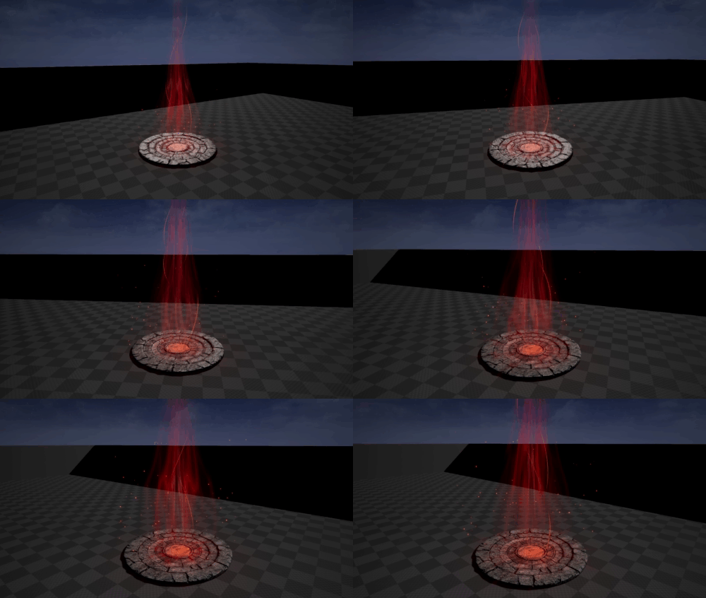
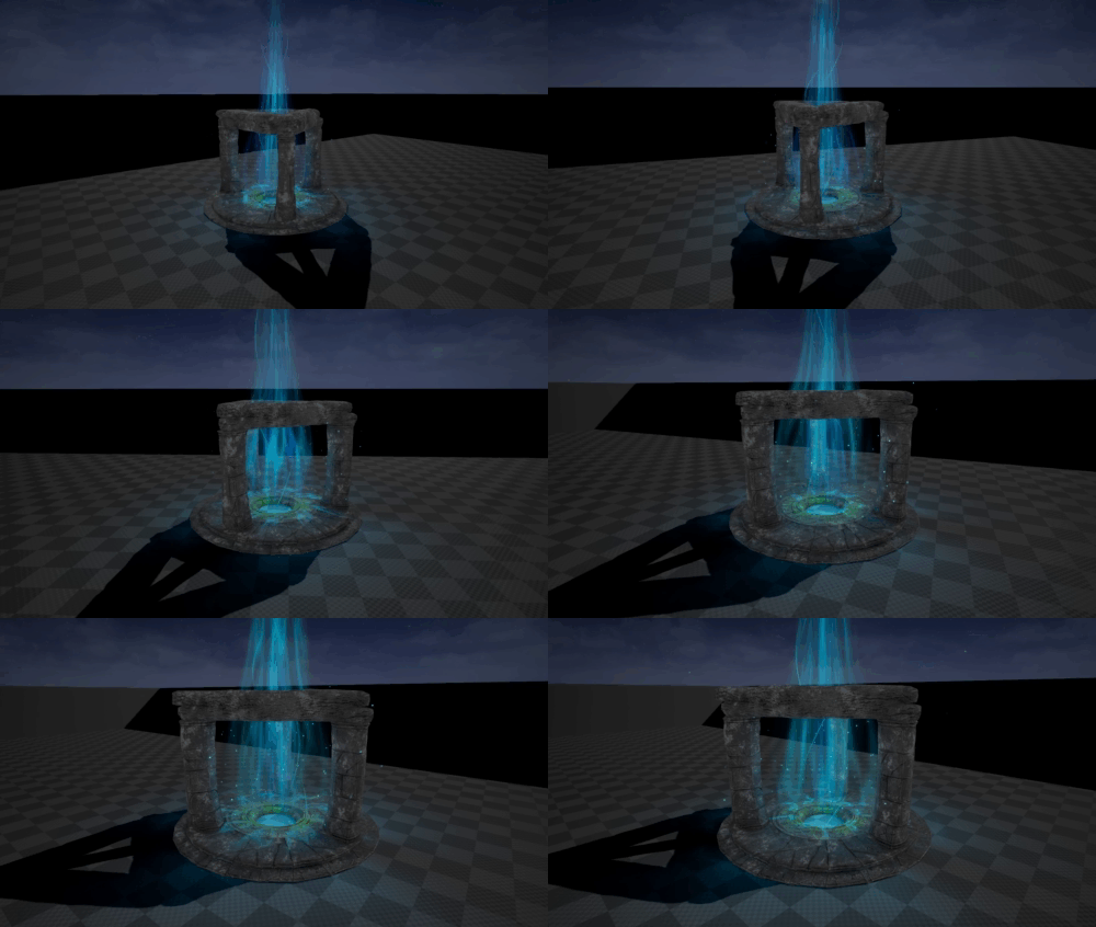
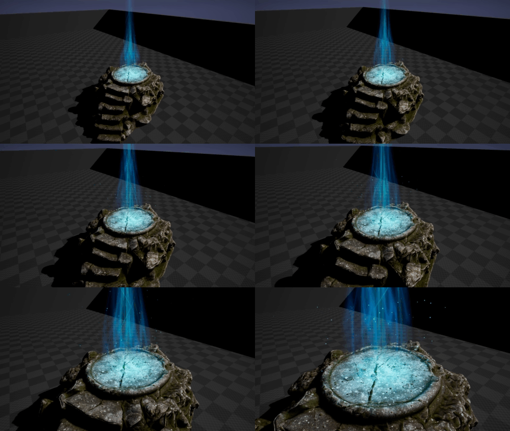
Now it’s time to show VFX of portals:
- Little, round with red glow - castle portal, located… “Inside the castles!” -prompting captain. Only legal castle owners can use it.
- Triangular and big, - city/village portal;
- Mossy and moldy - abandoned portal.
IV Animations
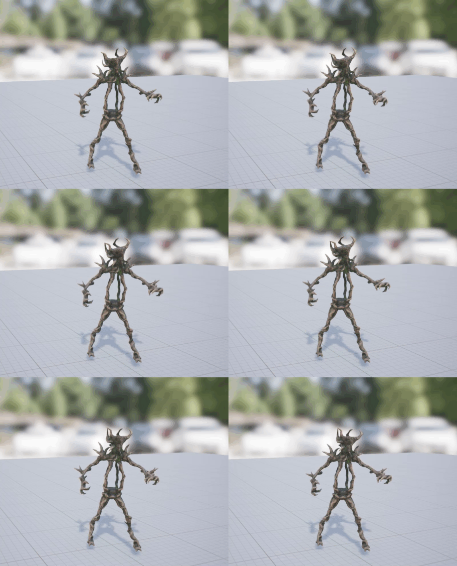
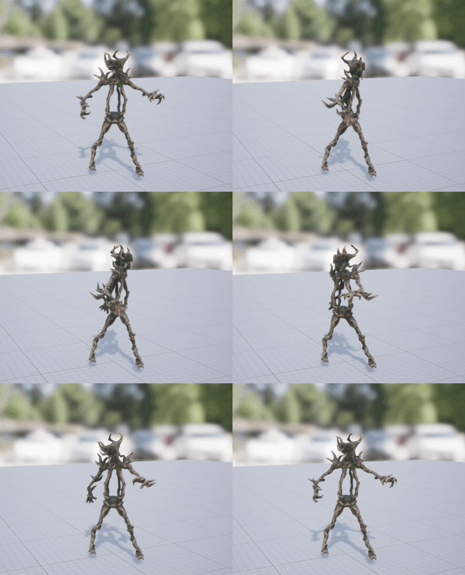
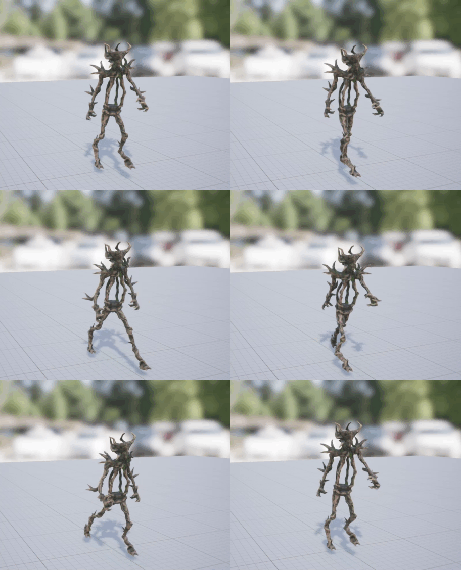
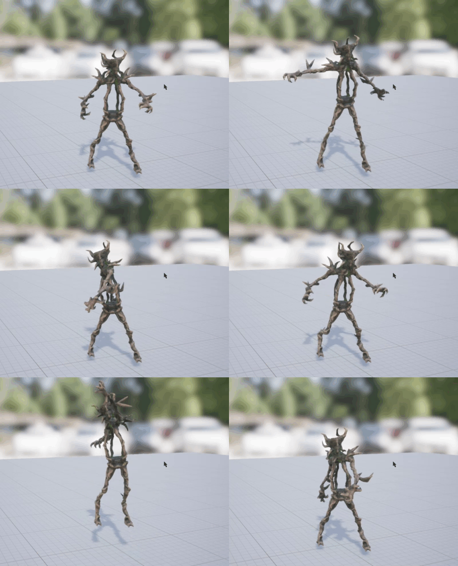
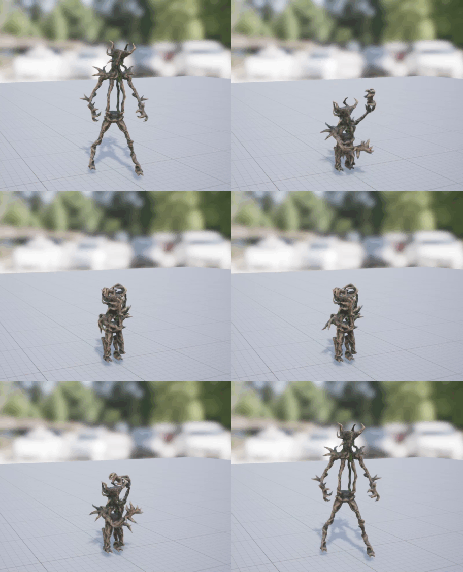
4.1. Stickman
Our old and favourite friend from the previous report got his own animations. He’s ready to show it:
It’s his basic stance. He’s just standing.
He’s looking around.
He’s taking part in the competition in power walking of summer 1072. Unfortunately, he will never be able to run.
He’s hitting. No one knows why he’s bouncing, because he’s not pocket-size.
He’s hiding with fear if you show him the fire.
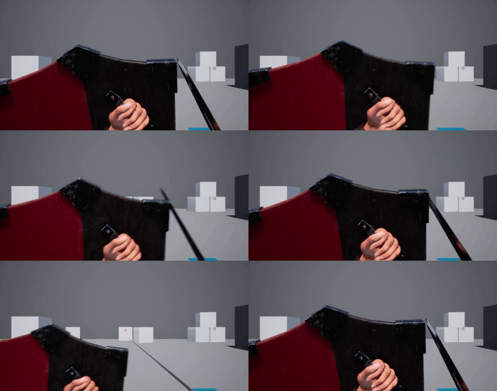
4.2. First-person animations
Work does not terminate on the first-person animations.
Sword + shield. Hit from the block. This is unique attack that will be available only for gladiator (It’s buff. Gladiator can use it almost constantly on the high levels).
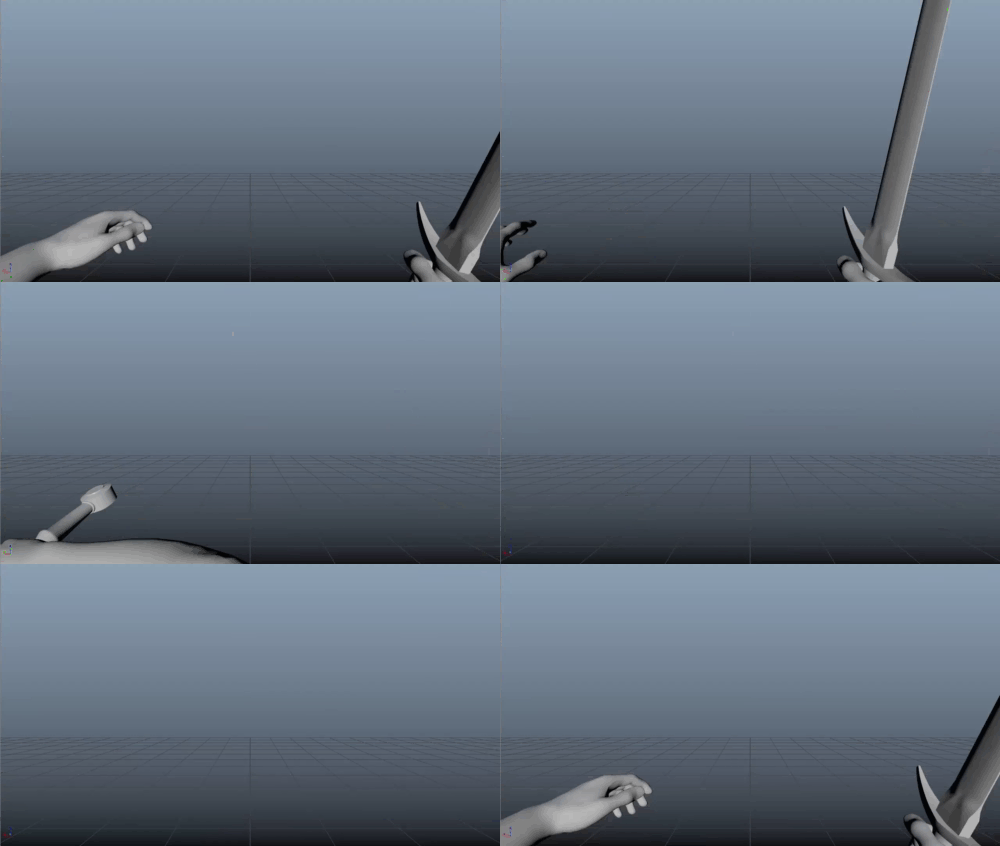
Sword and free hand. Hit 08-02. Left hand! By the way, it will have its own advantages. Some of them are essential.
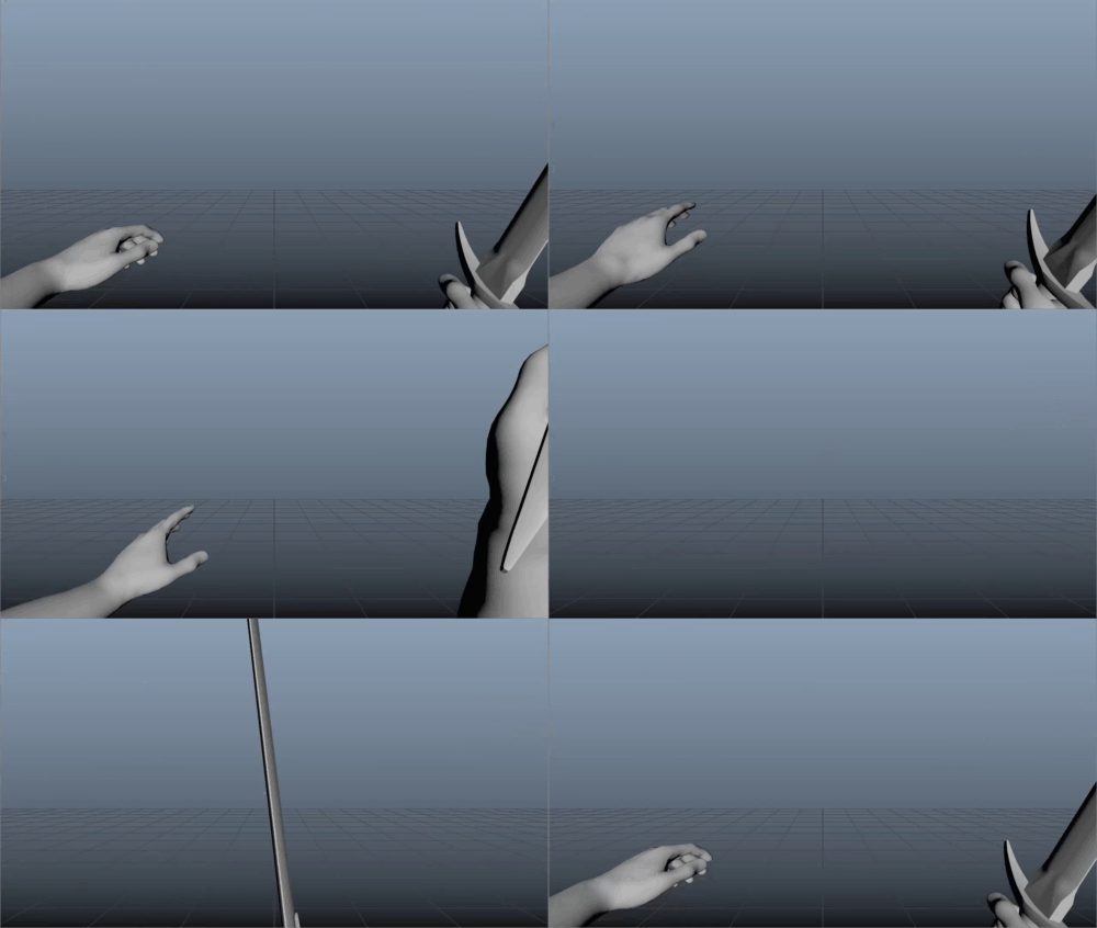
One-handed sword and free left hand. Hit 02-08. Some of advantages: reducing the cooldown time of 25%, unique attack with RMB. We are not sure in the need for the shield!
V UI
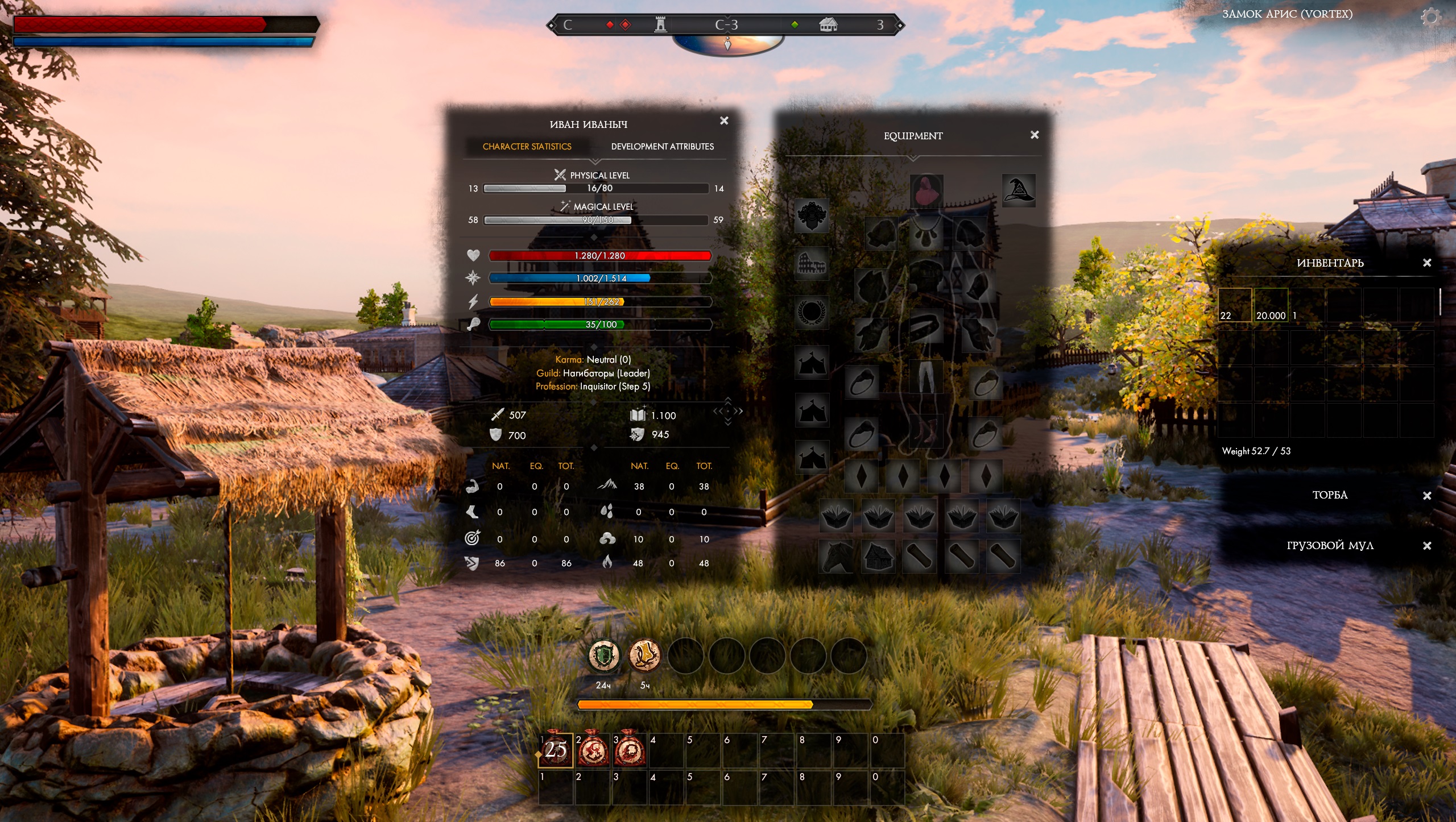
This week we were working on the equipment screen. At the moment, taking into account available mechanics, there will be additional 21 slots (Don’t pay attention to the icons - they are temporary).
Moreover we work on the compass: now it shows not only points of the compass but also the selected objects of the realm, marked places and group members.
But the happiest news for us: showed interfaces has already been implemented in the game. And soon it will be “alive”!
VI Conclusion
About essential for the alpha: audit is to develop, game client is lighter now - 15 gb (within the realm). But mobs, models of armour and weapons will add about 5 gb.
Little announcement of next report: active work is being conducted under the mobs. Probably we will show someone of named and huge mobs (bosses), and also other mobs: forest dwarf or niphon (it depends on who will be ready).
Thank you for your interest, watch the news, see you in a week!
Don’t forget to share your opinion and thoughts on our forum and Facebook.
