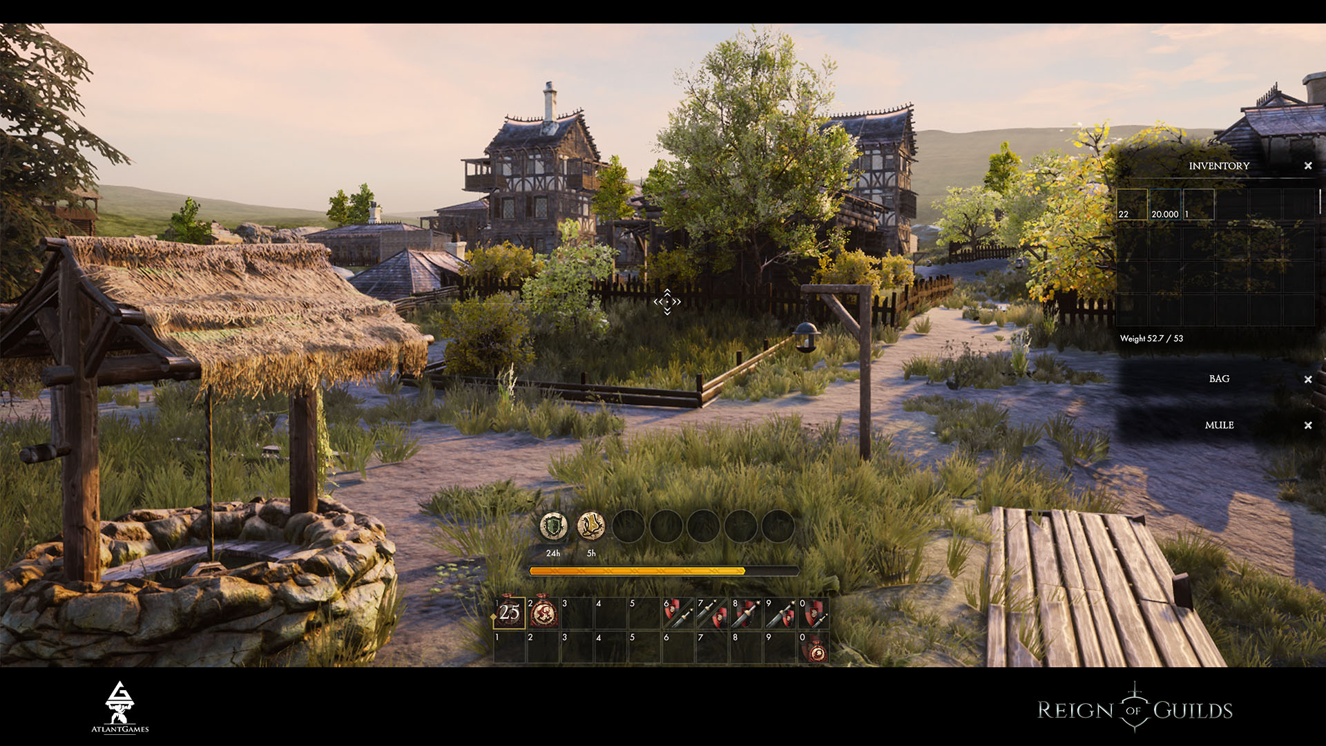
If you see Friday on the calendar, it means that ROG is on the air with the reports!
Neither more nor less, it’s already 19th report.
It was was technical week, as planned - we corrected more than created something new. Only in the end of the week we understood that it’s not only appropriate but essential to show the corrections. It improves the project as well as the new content. So wait for it for the next time.
That’s for now: models of expensive robes, dungeon drafts (mine), UI choice for the hotbar 2.0.
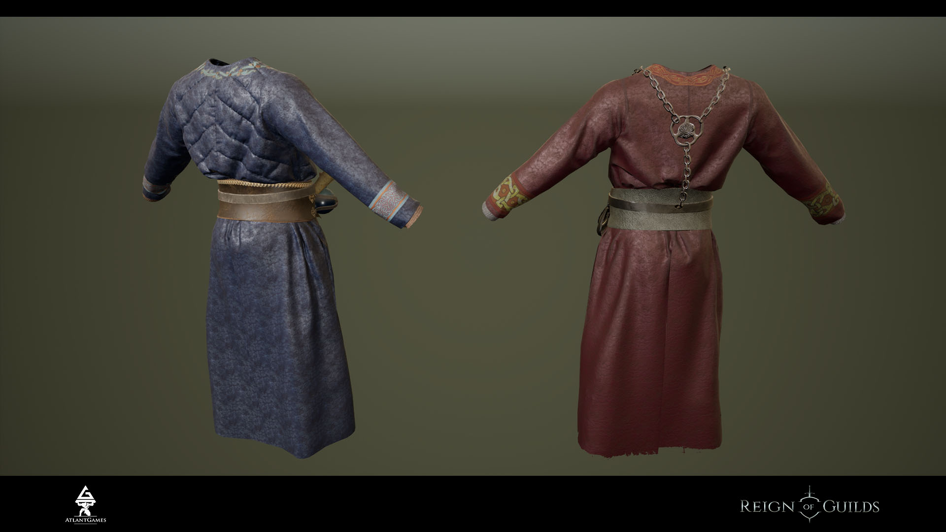
I 3D models - robes
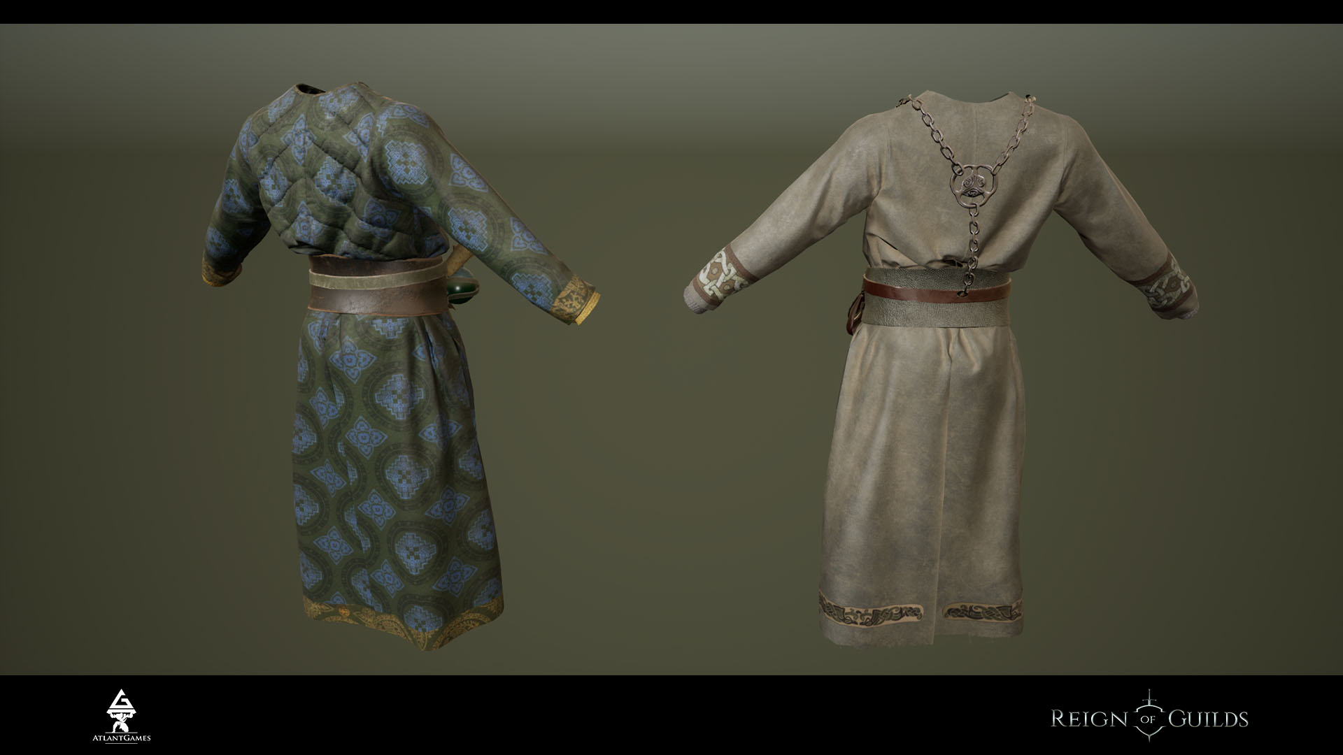
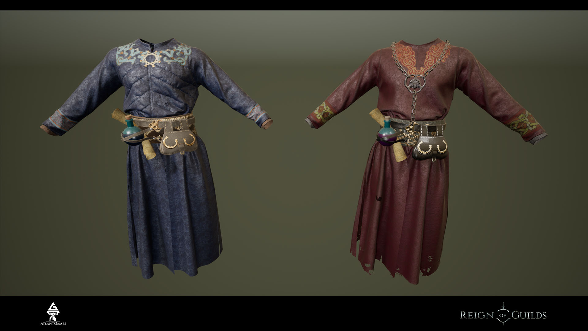
Pictures below provides examples of the most visually expensive robes to date. It will be included in the pre-order packs.
To use it (as well as the other "skins") you will need to have a game robe of the suitable element. After this the specially trained NPC can change the look of the item.
If you give an item with names skin to the other character - the item will turn to the original look.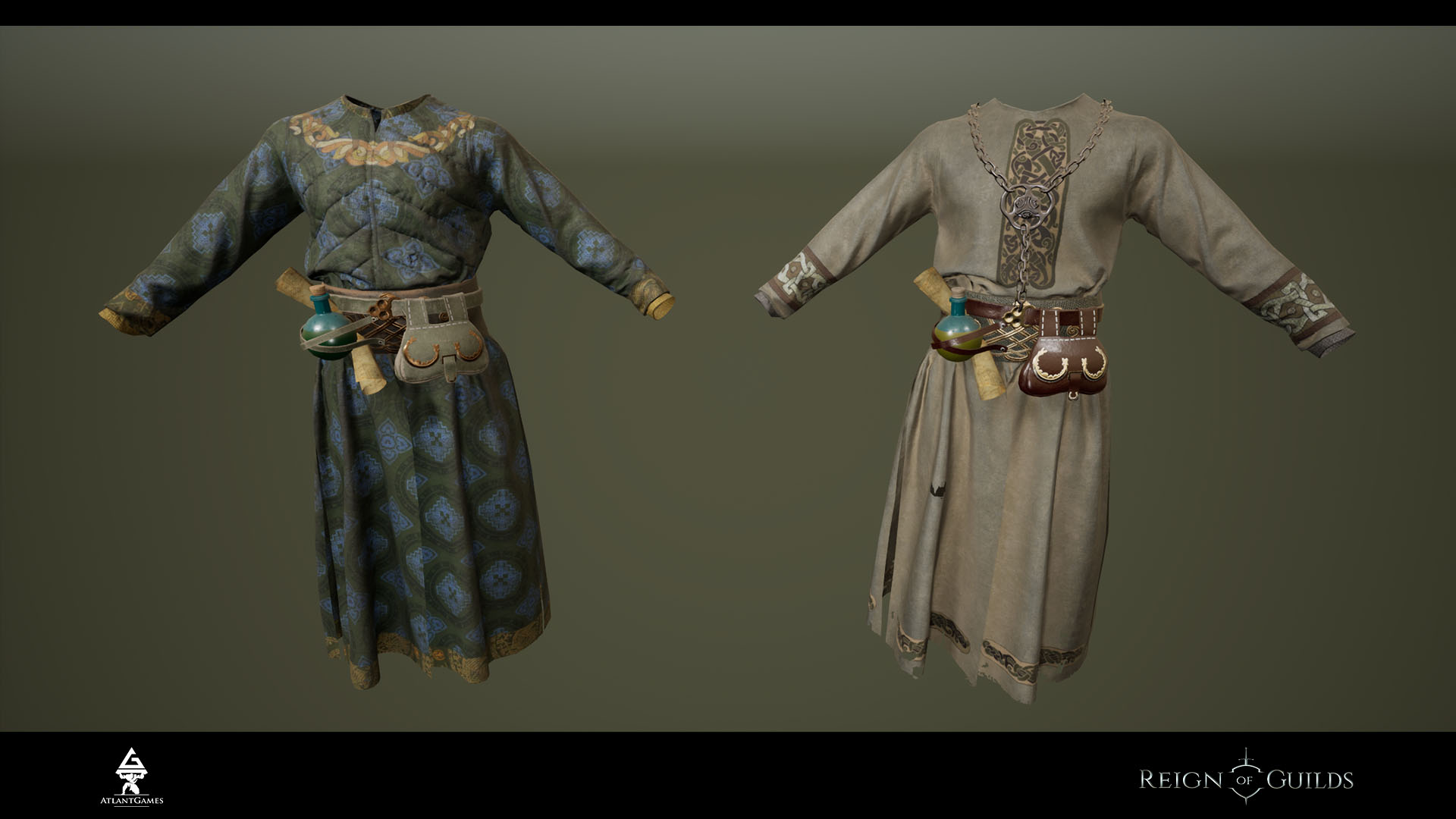
II Level design - mines
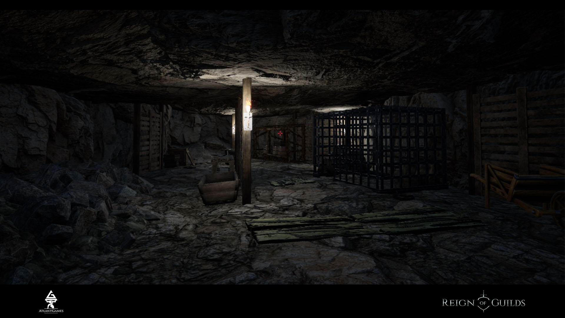
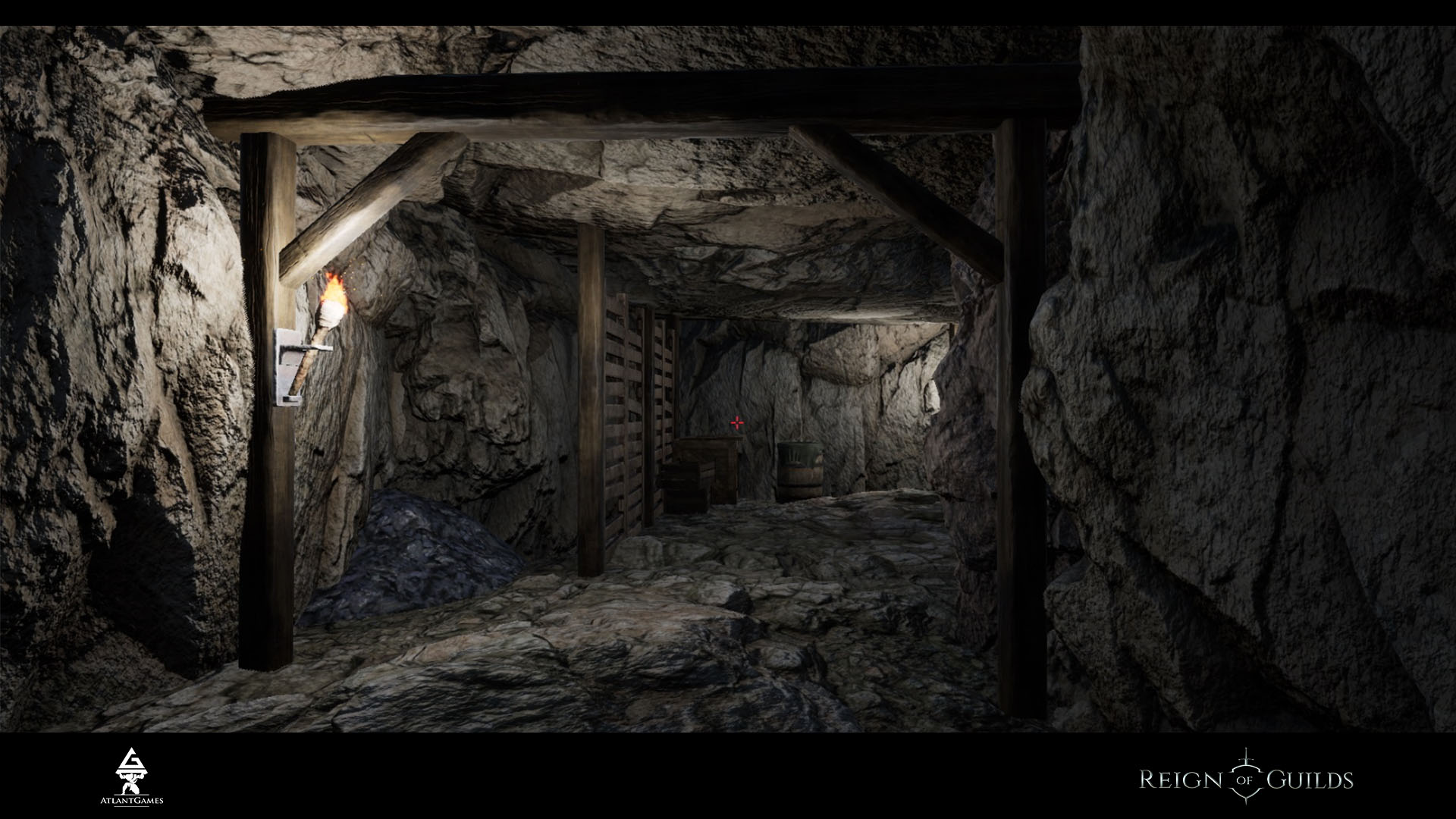
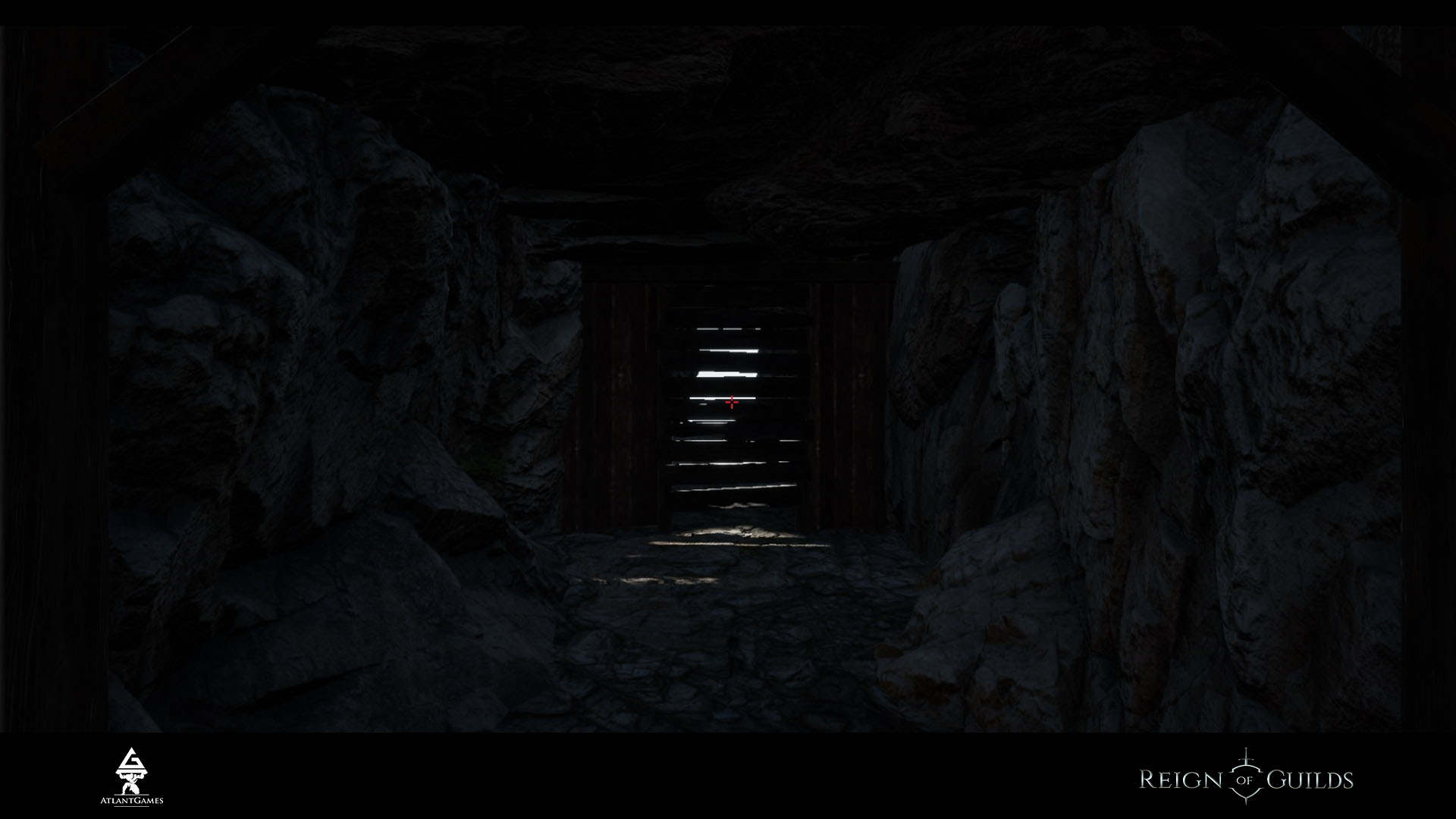
While we're busy with the structuring of the new world files to implement in the overall project, and as a result on the PTR, our designers have to work with dungeons. That’s why we decided to check what we will get at once. It’s very simple build from what’s on hand.
With such builds we check the general feel of the level and also the influence of the game design on the game process through the prism of the visualization.
Due to the fact that all effects are turned off, the light sources are reduced and there are no one VFX (mist, dust etc.), it can be said that it’s the minimal settings with 2k textures.

III UI
And the most interesting - our programmers create the joint element "Control 2.0 + Combat system 2.0".
Within the upgrade of the combat system and controlling there will be also the upgrade of the hotbar and as a result the upgrade of the all hotswaps of weapons.
Picture below provides the examples of the two items at the one cell:
- Cells "6-7" - basic variants where the division the cell into 2 icons occurs through the simplest way - in our view - it’s an outdated division model;
- Cell "8" - it looks very modern and lively, but there is a problem: an icon of a powder in the right hand takes 80% of the cell area. It leads to the covering of the shield. However it looks pretty with the set of shield+sword;
- Cell "9" - the logic is a bit wrong because the active item in the right hand should be at the forefront;
- Two-tiered "0": a top icon of a sword at the forefront takes only ¼ of the area. In our view it’s a bit small. A lower icon of a powder takes 70% of a cell height. It’s not too small and doesn’t cover the shield entirely.
We incline to “0” from the bottom tier.
Now turning to the new hotbar, we need to discuss it too - write your comments.
We’ve tried (yep, live) few variants and have found the next model:
- To put an item on the hotbar you need to drag it with the LMB, to delete two-tiered cell you need to delete the right hand item first;
- RMB on the hotbar cell turns one-handed mode into two-handed (if it’s provided) or swaps the duals (2*1-handed weapon) in this cell;
- If you drag a 2H weapon on the hotbar - it takes the whole cell and there could be no combinations;
- If you drag an item for the left hand to the empty cell - it will take the whole cell and hotswap for this cell will change the protective item for the left hand and won’t touch right hand;
- If you drag a 1H weapon for the right hand to the empty cell, it will take the whole cell (default) with its icon in the 2H mode (if possible), if it isn’t possible the icon will take 70% of the cell height in the 1H mode;
- If an 1H item is in the 1H mode, its equip won’t change the protective item in the left hand;
- If you drag an item for the left hand to the cell where is an 1H item for the right hand and vice versa - it will make a combination of these items in one cell;
- Hotswap will take 1 sec to change a weapon, equip/unequip separately - 500 ms.
IVConclusion
It’s ready and wait for its deploy on the PTR:
- corrections of the character animations;
- turning on and settings of the fabric physics for the armour and clothes items;;
- corrections of the weapons materials;
- 137 2D icons for the new weapons.
At the moment we’ve successfully adapted and structured 28 of 32 gb of the world files to implement in the project. The victory is just around the corner.
About the new site - we work on the hardest page:there are almost 50 notes with the pics and gifs. We can surely say that you have never seen such a detailed report about the pre-order content.
That’s all for now. Take care and follow the news and ROG in particular.
It’s Friday evening - ROGgoms up, friends!
Yours sincerely,
Reign of Guilds Team
